Dashboard.Four screens, four states.
An admin interface for an e-commerce platform. Every component re-drawn, every state considered — no off-the-shelf chrome.
The scope was four screens of the same view: the Orders table at rest, with the profile menu open, with the filter panel open, and with a filter dropdown active. Four small moments — each one designed to feel inevitable, none of them imported from a UI kit.
E-commerce platform
UI design — 4 states
2026
Figma
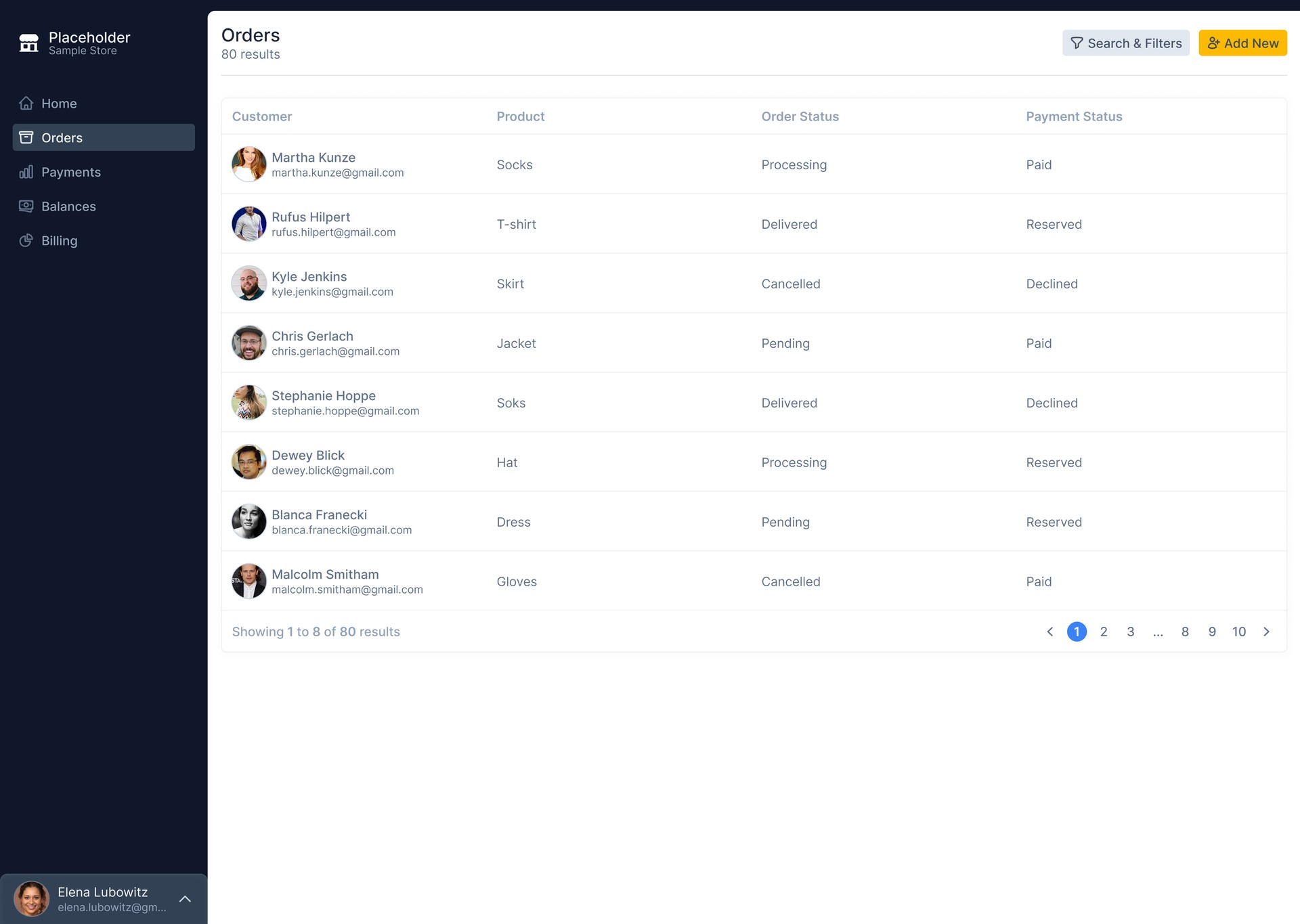
An admin worth opening every day. Not another SaaS template.
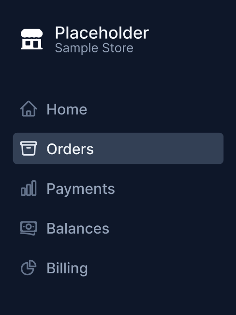
Five sections. One job each.
The nav is intentionally short. Home, Orders, Payments, Balances, Billing — every label is a noun, every section does one thing. No “Dashboard” item (the dashboard is the whole product), no “Reports” catch-all, no Settings cluttering the primary nav.
Settings and Logout live behind the user profile at the bottom — a quiet click away when needed, invisible the other 99% of the time. The chrome doesn't compete with the data.
The table, doing its job.
At rest, the screen is almost entirely data. Customer, Product, Order Status, Payment Status — four columns, eight rows visible, pagination at the bottom. The sidebar is collapsed to its essentials. The user's profile sits quietly at the bottom-left, an avatar and a chevron.
8 rows visible on a standard viewport. Enough to scan without scrolling, not so dense it feels like a spreadsheet.
Customer name + email in the leftmost column, indexed by avatar. The eye reads face → name → product → status.
Search & Filters (secondary, light blue) and Add New (primary, yellow) — top-right, where the user expects them.
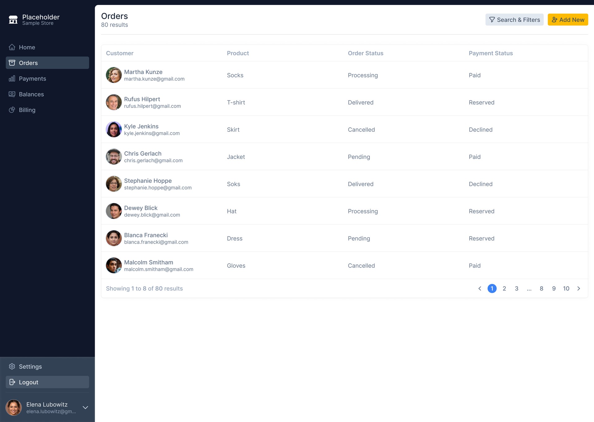
Quiet by default.
Available on click.
Most admin sidebars sit fully expanded — Settings, Logout, Help, Docs, all visible at all times. This one inverts that. The avatar is the only thing at rest. A click reveals Settings and Logout above it, hovering “Book time away” highlights with a subtle background change.
Single click on the avatar at bottom-left expands the menu. No hover state for opening — too easy to trigger accidentally on a dense screen.
Each menu item has a subtle background fill on hover. Visible enough to confirm targeting, quiet enough not to feel like an alert.
Settings and Logout are infrequent actions. They don't belong in the primary nav. Tucking them behind the avatar respects the chrome-to-data ratio.
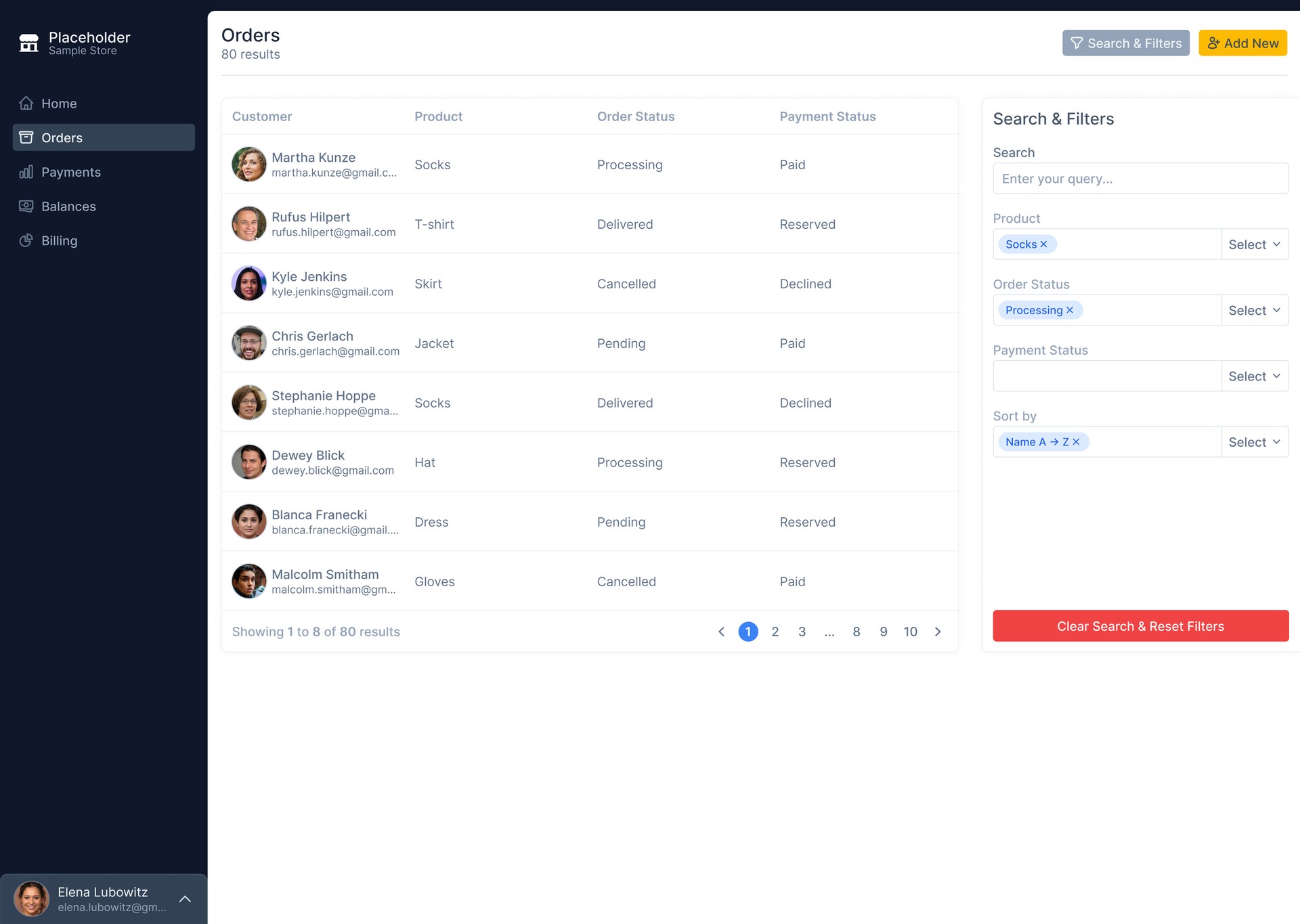
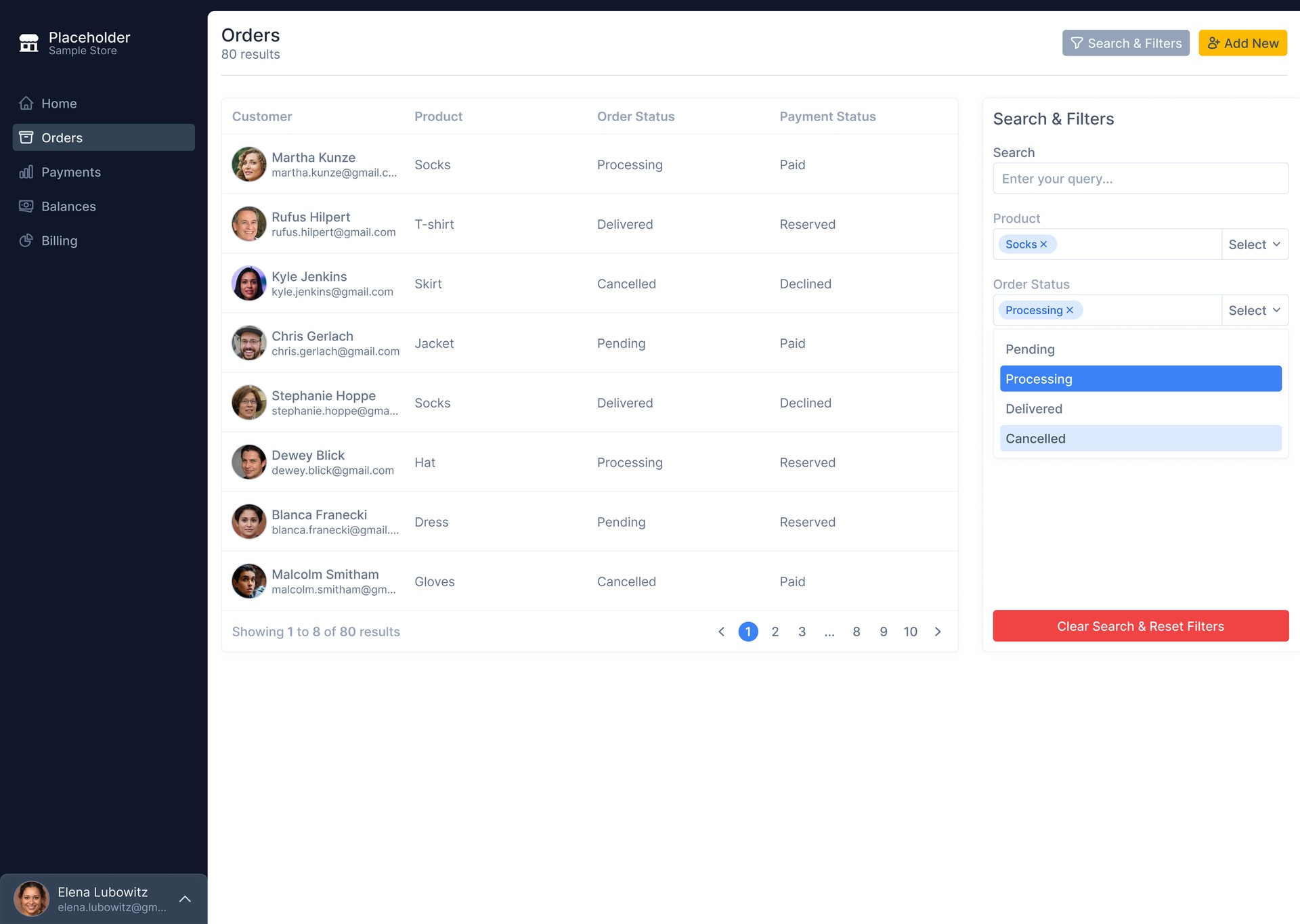
Filters alongside the data, not on top of it.
The filter panel slides in as a right-side companion. The table doesn't disappear, doesn't grey out, doesn't get covered by a modal — it stays visible, and shrinks slightly to share the screen. The user can adjust filters and see the table reshape in real time.
Active filters render as removable chips with an × — Socks ×, Processing ×, Name A→Z ×. The user always sees what's currently filtering the data.
Clear Search & Reset Filters button at the bottom — red, full-width, intentionally weighted. A destructive action that should look like one.
Filter panel ~25% width, table ~75%. The data stays the focus; the filters are the tool.
Two selection states.
One dropdown.
The Order Status dropdown introduces something most dropdowns don't have — two distinct selected states. Solid blue marks the user's current hover/active selection. Pale blue marks selections already confirmed. The user can see at a glance what's staged versus what's applied.
Active highlight. The item the user is currently interacting with — keyboard focus or mouse hover.
Confirmed selection. Already added to the filter chip set above. Visible inside the dropdown so the user remembers.
Multi-select filters fail when the user forgets what they've already selected. Showing both states inside the dropdown makes the system visible without explanation.
Four decisions worth defending.
Yellow Add New.
Primary action sits outside the blue navigation language. Two accent colors with two distinct jobs — blue for state, yellow for action.
Quiet sidebar.
Settings and Logout live behind the avatar, not in the main nav. The chrome respects the data's territory.
Two-state dropdown.
Active and confirmed selections render differently inside the same list. Multi-select made visible.
Red reset.
The “Clear Filters” button is red, not grey. A destructive action looking like one — by design, not by accident.
Five colors. Each with a single job.
A palette built for hierarchy, not decoration. Each color does one thing the others don't.
Navy
#081220
Sidebar, primary surface. The structural color.
Blue
#2563EB
Active selection, focus state, pagination current.
Yellow
#FACC15
Primary action — Add New. Used once per screen.
Red
#EF4444
Destructive action — Clear & Reset. Weight matched to consequence.
Paper
#FAFAF9
Background, the surface everything else sits on.
The chrome doesn't compete with the data.
That's the whole job.
— Notes on the dashboard, 2026