Prosperaize.
A system that works everywhere they do.
An AI strategy consultancy with a real brand and not enough places to put it. We refined the foundation, then built every surface the brand actually lives on.
Prosperaize advises companies on AI strategy. Their original brand had the bones — a confident wordmark, a strong palette, a serious editorial sensibility. What it didn’t have was a system. We refined the existing brand and built the surfaces it needed to actually work — a long-form PDF report, a case study format, blog post templates, LinkedIn templates, a website form, and a download page. One brand, six surfaces, one consistent voice.
A brand that works everywhere they actually use it.
Refine. Extend. Repeat. Don’t reinvent.
Honor what works.
The wordmark, the blue, the editorial tone — these were already right. We didn’t redesign the brand. We sharpened it.
Build for repetition.
Blog posts, LinkedIn posts, case studies — these get made every week. The system had to be fast, consistent, and forgiving.
Treat content like a report.
Editorial typography, structured layouts, data visualization that respects the reader. Consultancy work read like consultancy work.
Every surface, one voice.
From a 30-page PDF to a single LinkedIn carousel slide — the same typographic rules, the same palette, the same restraint.
Six surfaces. One system.
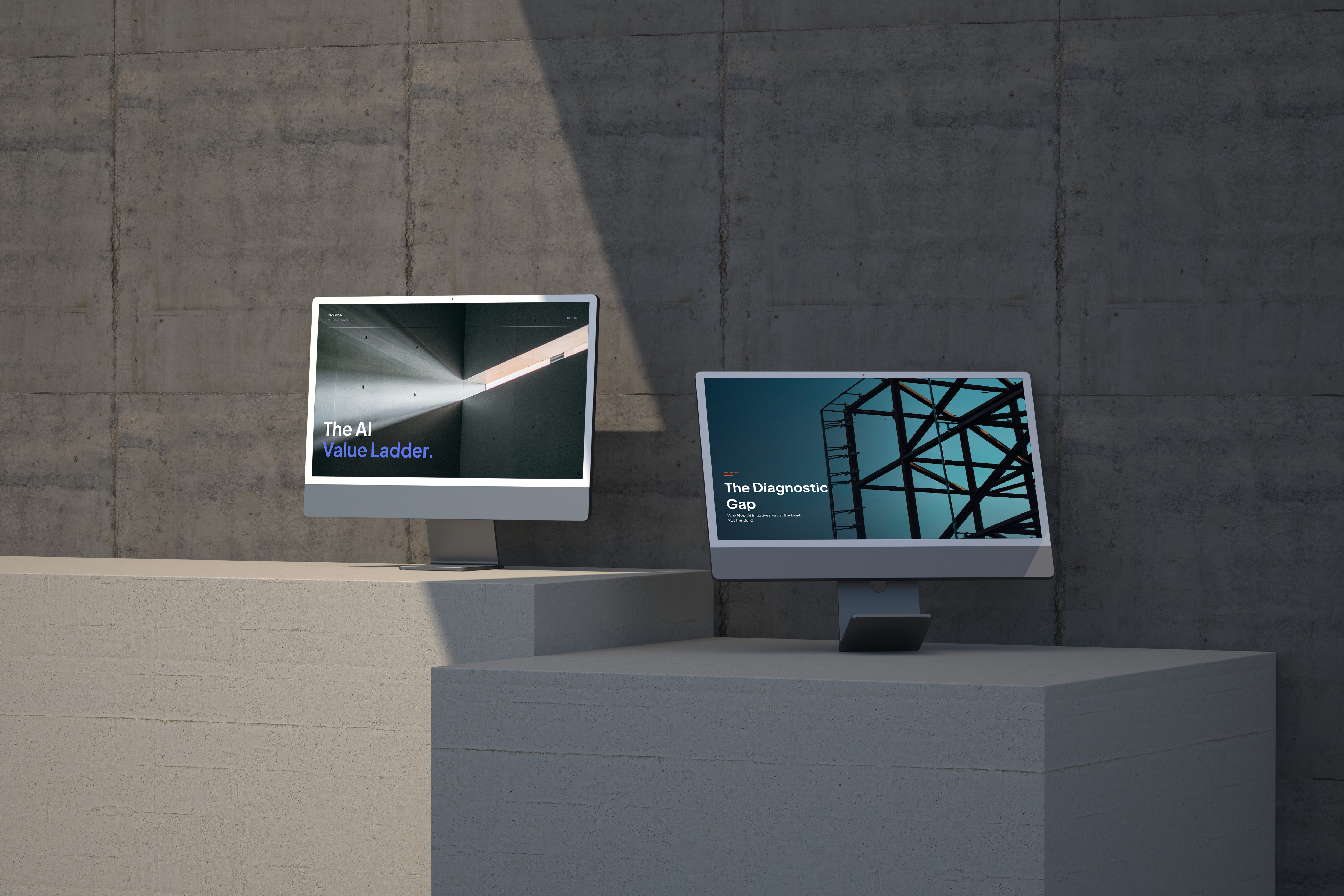
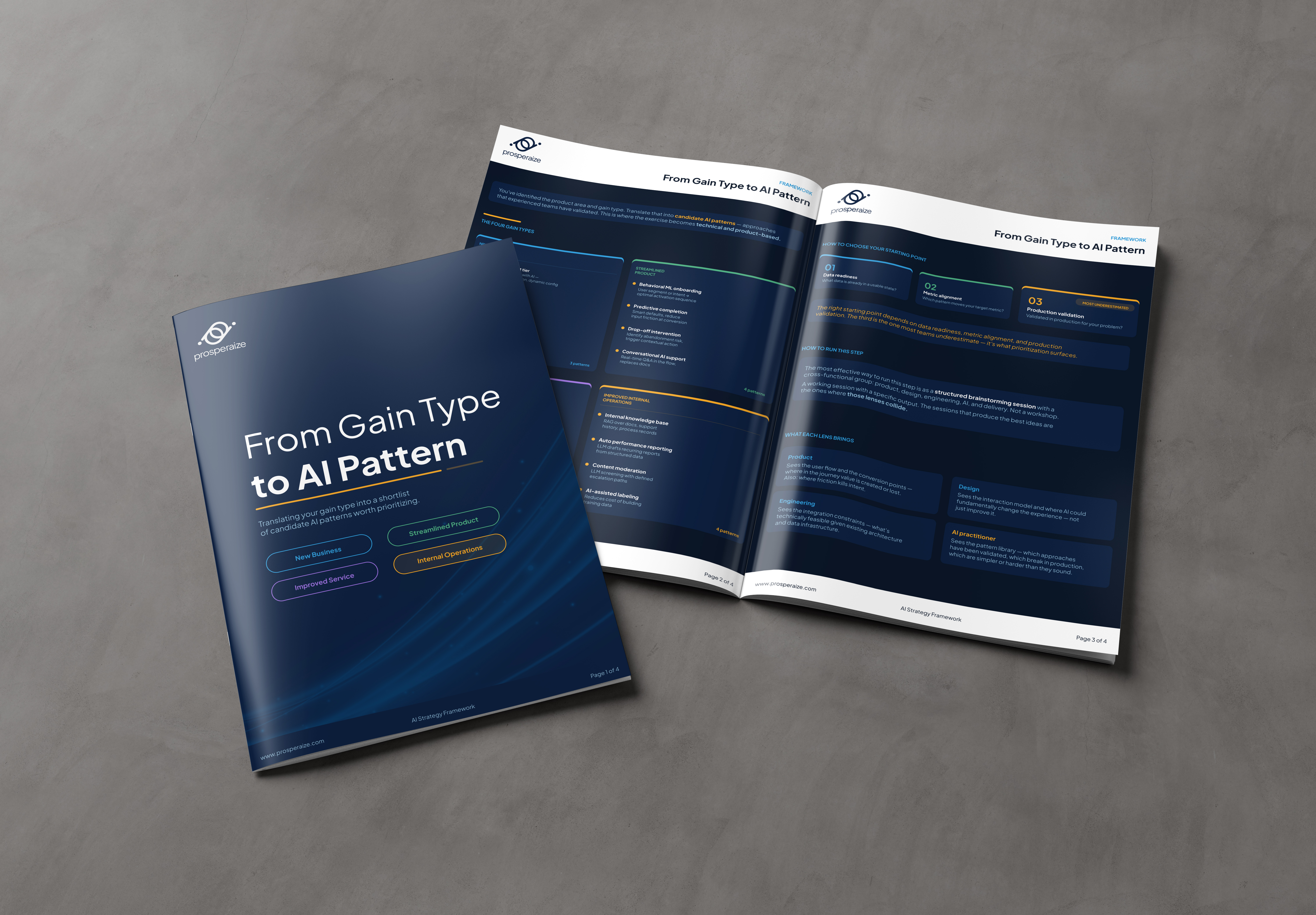
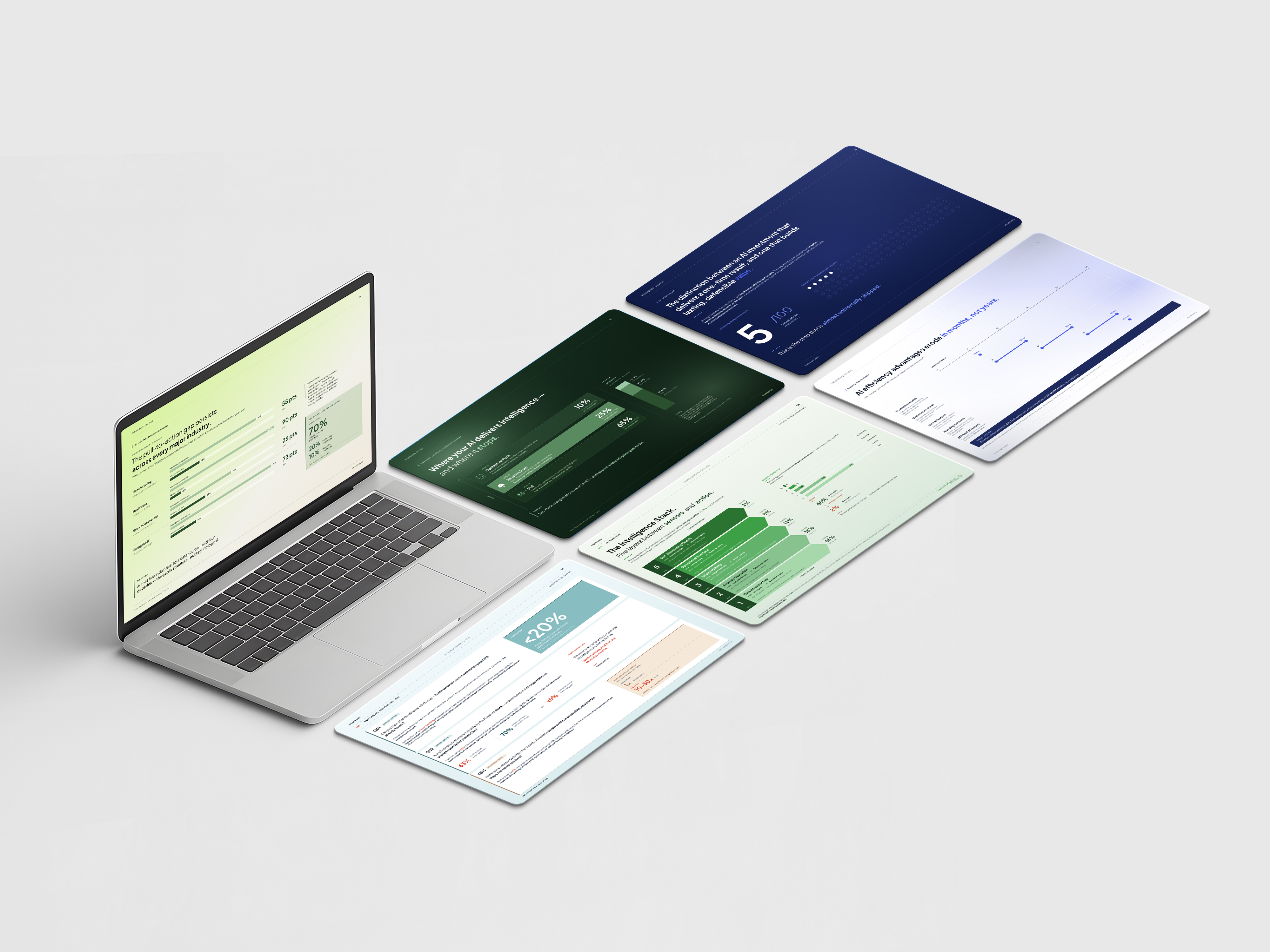
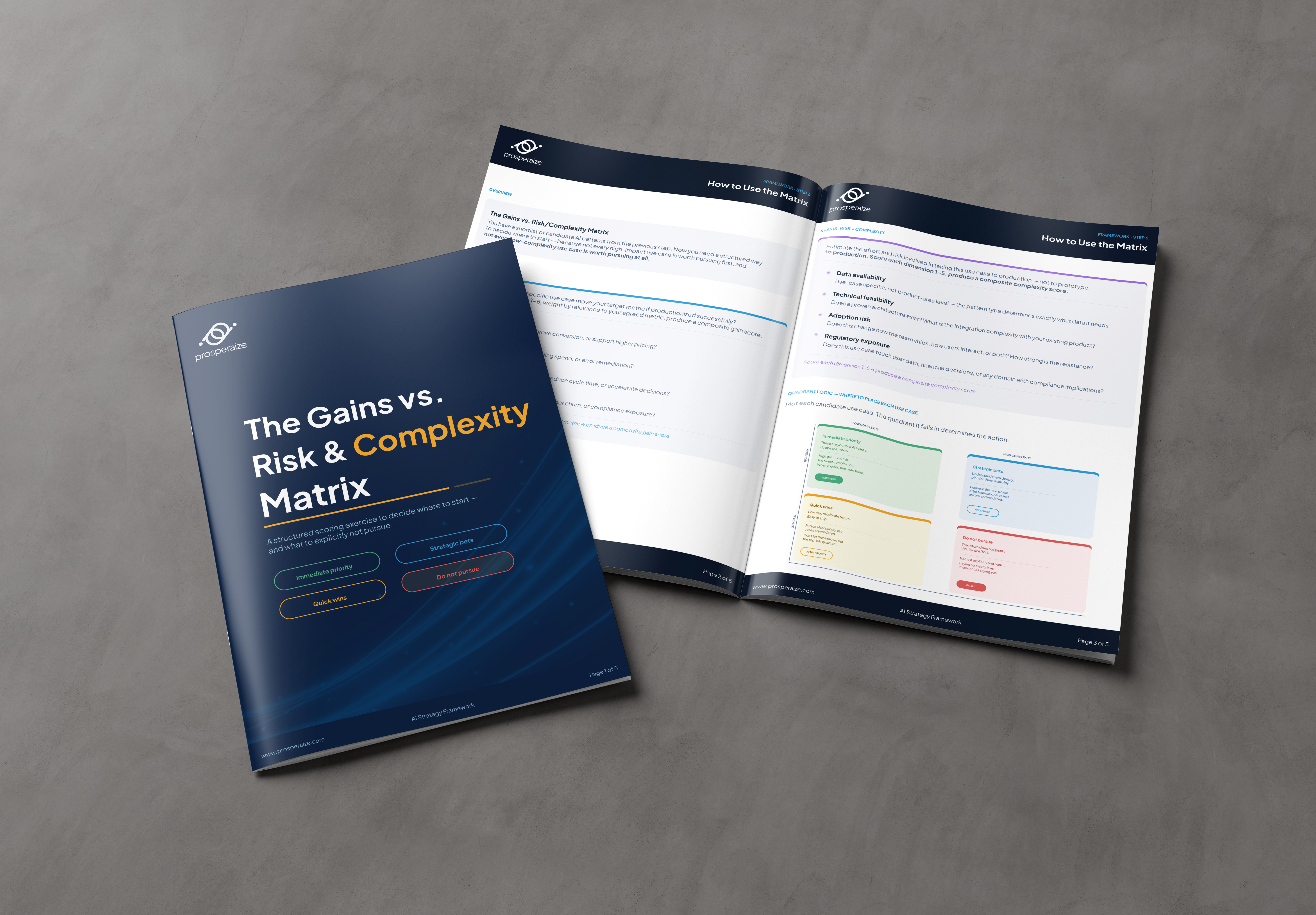
PDF Report
A long-form editorial PDF with covers, section openers, data spreads, pull quotes, and footnoted research. The flagship deliverable.
Case Study Format
A repeatable case study layout for client work — same typographic rules, scaled for shorter narratives.
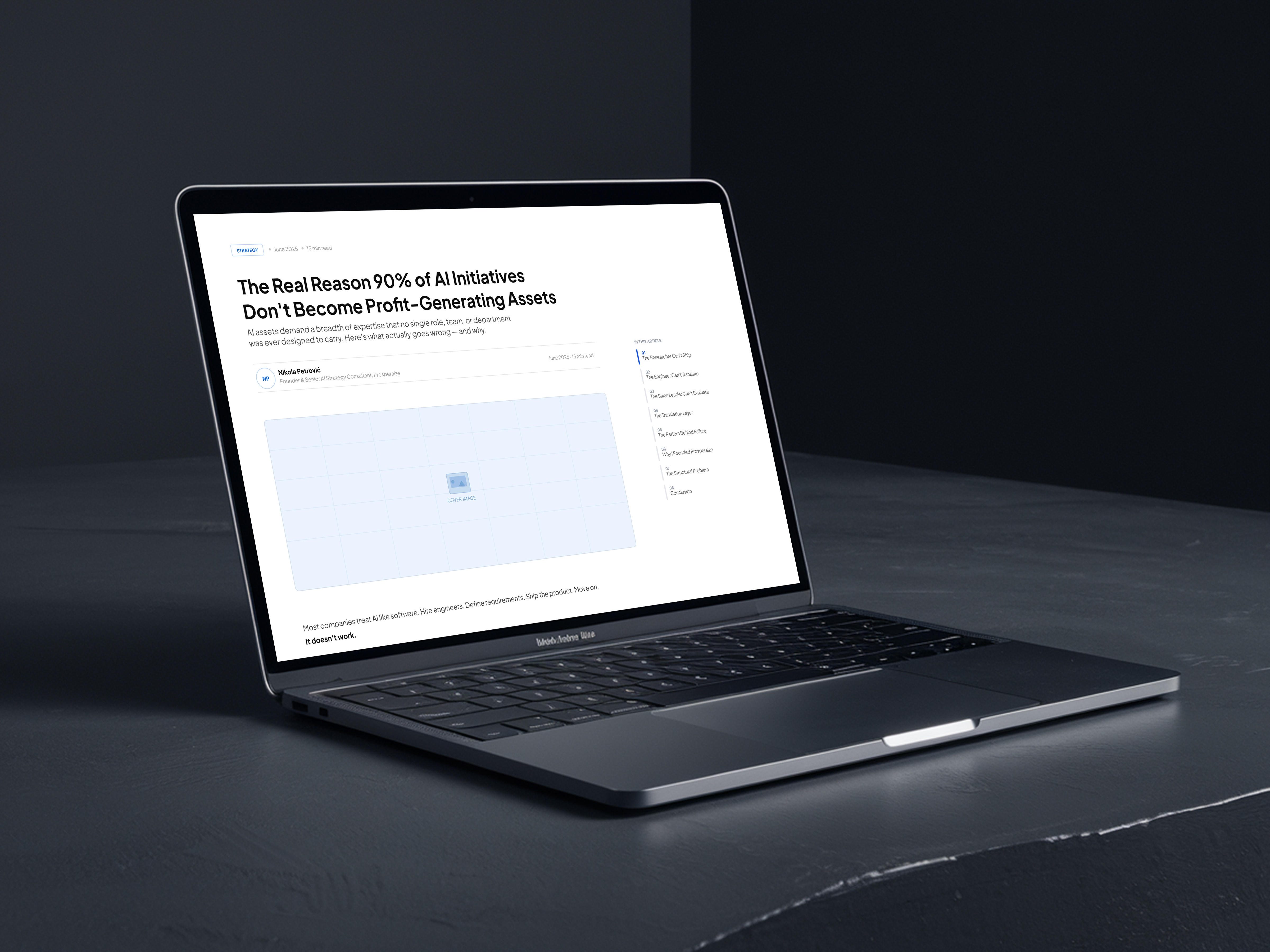
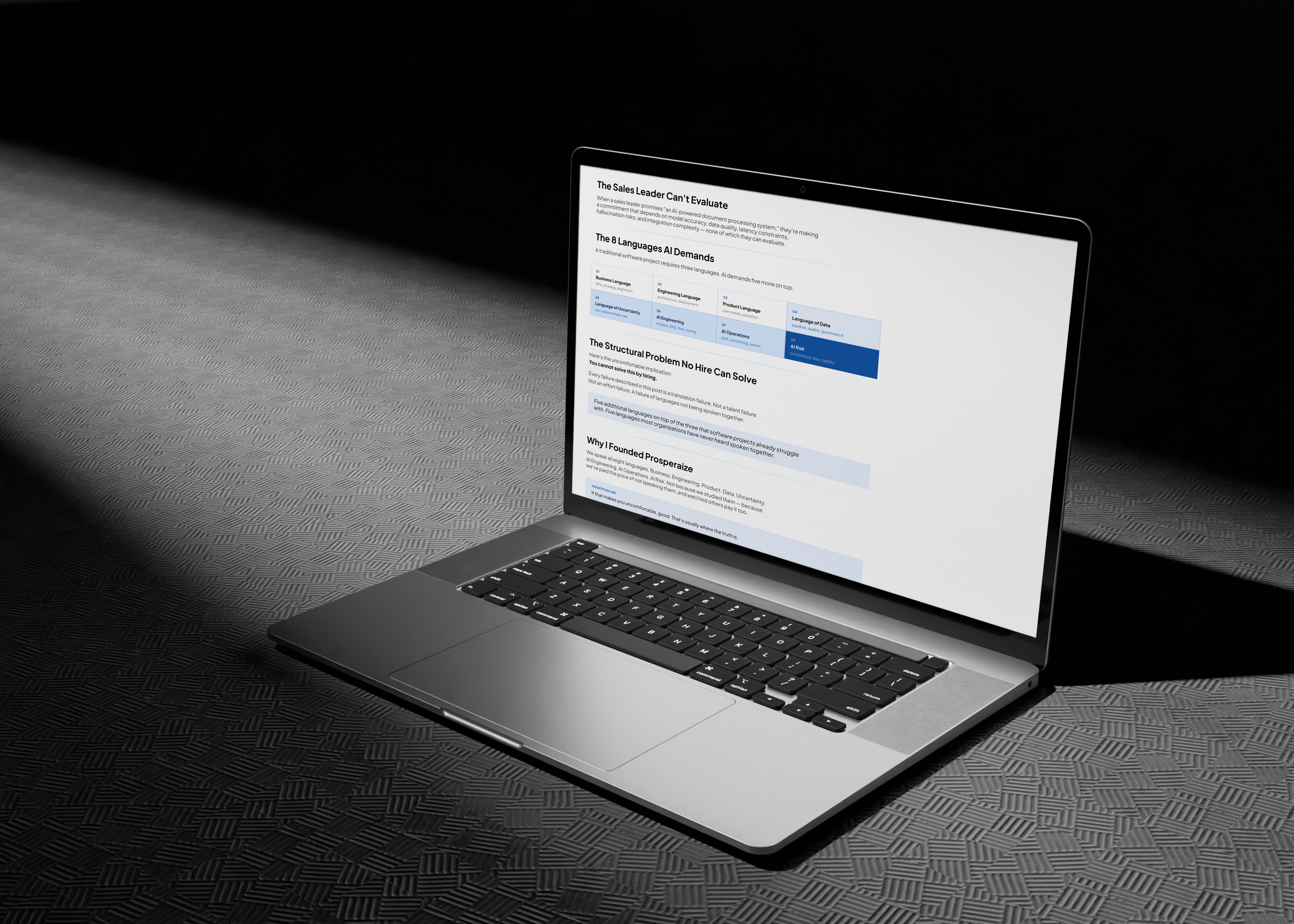
Blog Post Templates
A system for the company blog — hero treatments, body type rules, callouts, data treatments, end-of-article CTAs.
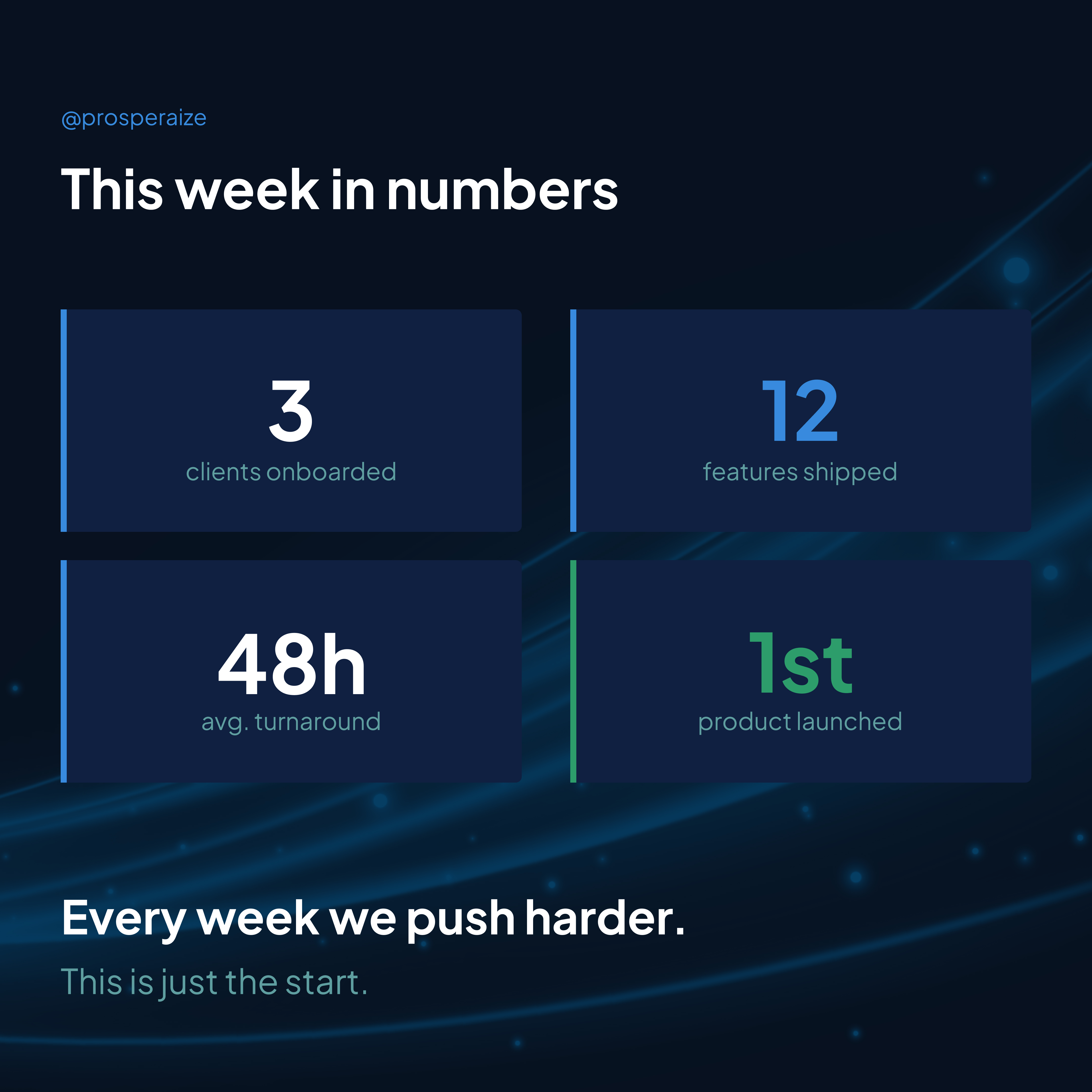
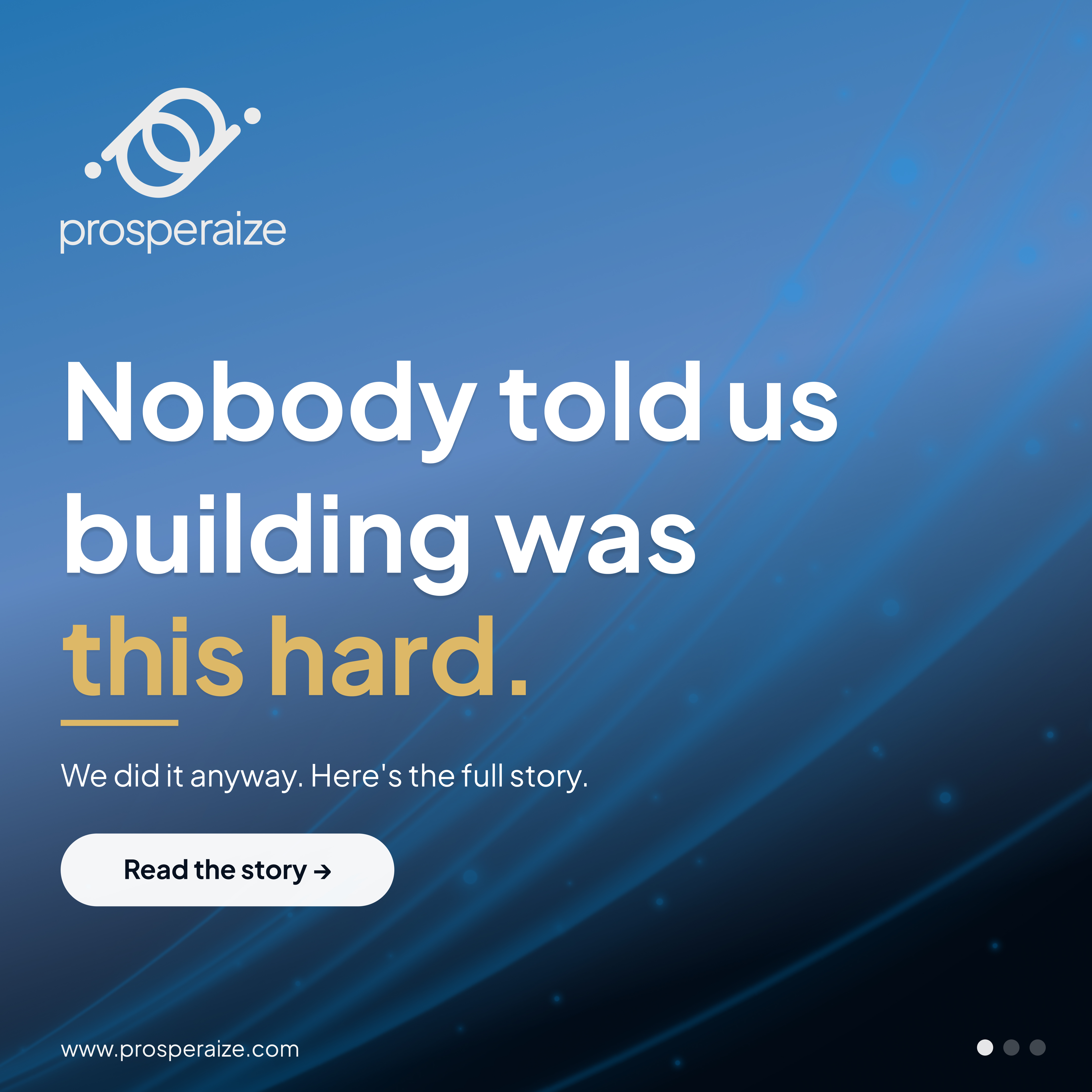
LinkedIn Templates
A repeatable set of post and carousel templates — quote cards, data slides, announcements, listicle frames.
Website Form
The contact / inquiry form on the website — typography, field design, and confirmation states.
Download Page
The page where guests download the PDF report — gated form, confirmation state, and thank-you.

Plus Jakarta for the headline. Inter for the rest.
Prosperaize · Section Openers · Pull Quotes
Geometric sans with editorial weight. Used heavy for headlines, big numbers, statement type. The brand's signature voice.
Most companies announce AI initiatives expecting transformation. They get incremental productivity gains — useful, but not strategic. The gap between aspiration and reality is the real story.
Neutral sans, light weight. Used for body type, captions, data labels, footnotes. Carries the consultancy's substance.
Five values. Each with one job.
A palette refined from the original brand. Periwinkle blue does the heavy lifting; deep blue, ink, and tint values support; one green note for accent.
Type, deepest contrast, footer surfaces.
Primary accent. CTAs, callouts, big numbers.
Section panels, supporting surfaces, the editorial signature.
Positive metrics, secondary accent. Used sparingly.
Backgrounds, the page itself.
Four moves worth defending.
Periwinkle, not navy.
Most B2B consultancies default to navy — safe, generic, indistinguishable. The original brand chose a softer periwinkle blue. We kept it and built the whole system around making that choice feel inevitable.
Numerals like a magazine.
Section openers use a huge “02” treatment — the same way Monocle or Wired marks chapters. Turns a PDF from a deck into a report worth keeping.
Same DNA across six surfaces.
The PDF, the blog, LinkedIn, the form — same typography rules, same color logic, same hierarchy. A reader who sees a LinkedIn post and lands on the PDF feels the continuity without naming it.
Data over decoration.
No stock illustrations. No background patterns. Where the work needs visuals, it gets charts, callouts, or photographic detail. The substance is the design.