Reading The Brand Gap
Marty Neumeier wrote The Brand Gap for companies with brand departments. I read it with a florist on the phone who is fairly sure a logo is a picture of a flower — and the bones still hold at the scale of a one-room studio.
The Brand Gap is twenty years old. Neumeier wrote it for companies with brand departments — places where a brand manager coaches a marketing team, where a "superteam" of specialist firms orbits a single account, where Interbrand publishes a number next to your name and that number moves your stock price.
I have no brand department. I have me. And, on any given week, a florist who is fairly sure a logo is a picture of a flower.
A logo is a picture of a flower.
— What my client is fairly sure of
So I read the book the way I read most brand books: half nodding, half arguing. The strange thing is how much of it survives the trip down to my scale. The vocabulary is corporate. The truth underneath it is small enough to fit in a one-room studio.
A brand is a gut feeling, and that's the hardest sentence I have to sell
Neumeier's definition is the cleanest in the book: a brand is a person's gut feeling about a product, service, or company. Not the logo. Not the palette. The feeling, which lives in someone else's head and which you do not control.
I believe this completely. I also can't say it to a client on the first call, because it sounds like I'm talking myself out of work. If the brand lives in the customer's gut, what exactly am I charging you to make?
The answer is the part Neumeier puts gently and I have to put plainly: you can't control the feeling, but you can influence it, and almost everything that influences it is a decision someone has to make on purpose. The flower shop's feeling of calm, a little expensive, worth it doesn't arrive by accident. It's the typeface, the spacing, the photo that isn't a stock photo, the fact that the website loads and the prices are visible. A brand is a gut feeling. My job is to remove every reason for that gut feeling to be "this looks like everyone else."
Aesthetic is the cheapest part
The line I underlined hardest is the one about why brand suddenly matters: we've become information-rich and time-poor, and the old way of choosing — comparing features and benefits — no longer works. Everyone has the same features now. Everyone copies them by Tuesday.
This is the whole argument for what I do, and it's also where the book quietly disagrees with how most small businesses spend. If features are dead and feeling is everything, then the look — the surface, the thing people think they're buying when they buy "branding" — is the cheapest part of the entire system. It's the easiest thing to get right and the least of what's actually doing the work. A beautiful logo on top of a brand that ghosts its customers, hides its prices, and can't describe what it does in one sentence is a Ferrari with flat tires, to borrow Neumeier's line. Looks good in the specs. Fails on the street.
I say this to clients who come in wanting "just a logo." The logo is the cheapest thing you'll buy from me. The expensive part is the decisions underneath it.
Focus means giving something up, which is why nobody wants to
Three most important words in branding, he says: focus, focus, focus. The danger is never too much focus. It's too little — a brand so broad it stands for nothing.
Everyone agrees with this in theory and resists it in practice, because focus means saying no to revenue you can see. This is the three-options problem. A client asks for three logo directions, and what they're really asking is to not decide — to keep all the doors open, to be a florist and an event planner and a gift shop, because narrowing feels like losing money. Neumeier's answer is the right one: it's usually better to be number one in a small category than number three in a large one. Focus isn't subtraction for its own sake. It's how a two-person business becomes the obvious choice for one specific person instead of a forgettable option for everyone.
I don't hand over menus of options anymore, and this is part of why. A menu is me refusing to focus on the client's behalf.
Logic and magic
The part of the book that most designers quote, and most clients distrust, is the fifth goal of design. Traditional design has four jobs — identify, inform, entertain, persuade. Branding adds a fifth: to differentiate. The first four are tactical. The fifth is strategic, with roots in aesthetics, and Neumeier calls it a combination of logic and magic.
I like that he refuses to pick a side. Our whole culture leans on the logic half — rational thinking became the only thinking you were allowed to trust somewhere around the Enlightenment — and so a client will happily pay for a strategy deck full of charts and flinch at the line item that says "design." But the deck doesn't make anyone feel anything. The magic does. And magic is the hard part to control, which is exactly why it's worth paying for. Anyone can copy your features. Almost no one can copy the specific way your brand makes a person feel understood.
The strategy deck doesn't make anyone feel anything. The magic does.
— ANGELA'S STUDIO
When everybody zigs, zag. Easy to say, difficult to do, because we're social animals and zagging means standing alone for a minute. For a small studio it's not even about reinventing anything. It's the most advanced yet acceptable solution — different enough to be noticed, familiar enough to be trusted. The Beatles, in Neumeier's example, never did the same thing once, but they didn't start there. They earned the strange records by making acceptable ones first.
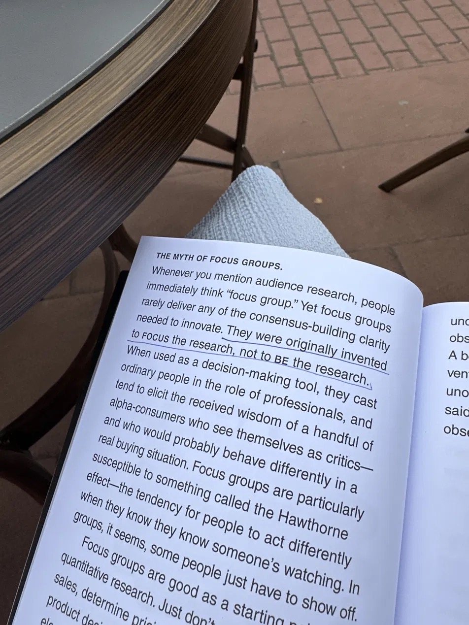
Faster horses, and the myth of the focus group
Henry Ford's line shows up here: if he'd asked people what they wanted, they'd have said faster horses. Neumeier uses it to defend intuition against research, and then — to his credit — turns around and defends research too. Innovators treat market research like charting the future in a rearview mirror. Fair. But the book's better point is the one I actually use: it's usually better to get a rough answer to the right question than a detailed answer to the wrong one. Why boil the ocean to make a cup of tea.
I don't run focus groups. I can't afford to, and they wouldn't help — focus groups were invented to focus research, not to be the research, and they tend to turn ordinary people into critics performing for the room. But the cheap version of testing is available to anyone, including a studio of one. Show the work to ten real people, one at a time, and never ask "which one do you like?" Liking is useless. Ask what they think it means, what it reminds them of, whether they'd expect this kind of business to make this kind of promise. The answer to "why" is the seed of the next question. That's a focus group I can run with a coffee and a phone.
Get born well
The two lines I keep coming back to sit far apart in the book and say nearly the same thing. On naming, Neumeier borrows from Shaw: take care to get born well. And near the end, on the living brand: don't worry, be crappy — let the brand live, breathe, make mistakes, be human.
These only sound contradictory. Get born well is about the parts you decide once and carry forever — the name, the core, the defining attributes you don't abandon. Be human is about everything after — the daily performance, the phone calls and invoices and replies that are also, quietly, the brand. A brand resonates when the outside matches the inside. If it looks like a duck and quacks like a duck but swims like a dog, people start to wonder.
That last part isn't in the strategy deck, and it's the part I find myself selling hardest to the smallest clients. The logo is the cheapest thing. Getting born well is a decision. Behaving like the brand you designed, every day, on every dull email — that's the whole job, and no one can do it for you.
Twenty years on, in a market Neumeier didn't quite see coming, that's what survives the trip down to a studio of one. Strip out the brand departments and the superteams and the valuations, and the bones are still good: a brand is a feeling, the look is the least of it, focus costs something, and you have to behave like yourself on purpose.
I didn't need a department to learn that.
I needed about thirty clients and a stubborn refusal to use templates.
Read next
Design from the inside out.
An honest case for working alone, written by someone who isn't entirely sure she'll always work alone — but who knows what would be lost if she didn't.