A café inside a cultural institution. Half gallery, half neighborhood — and a brand that lives comfortably in both.
Cafe Museum sits inside a museum. Visitors come for the exhibitions; they stay for the coffee. The existing identity was generic — it could have belonged to any café on any street corner. We built one that could only belong here.
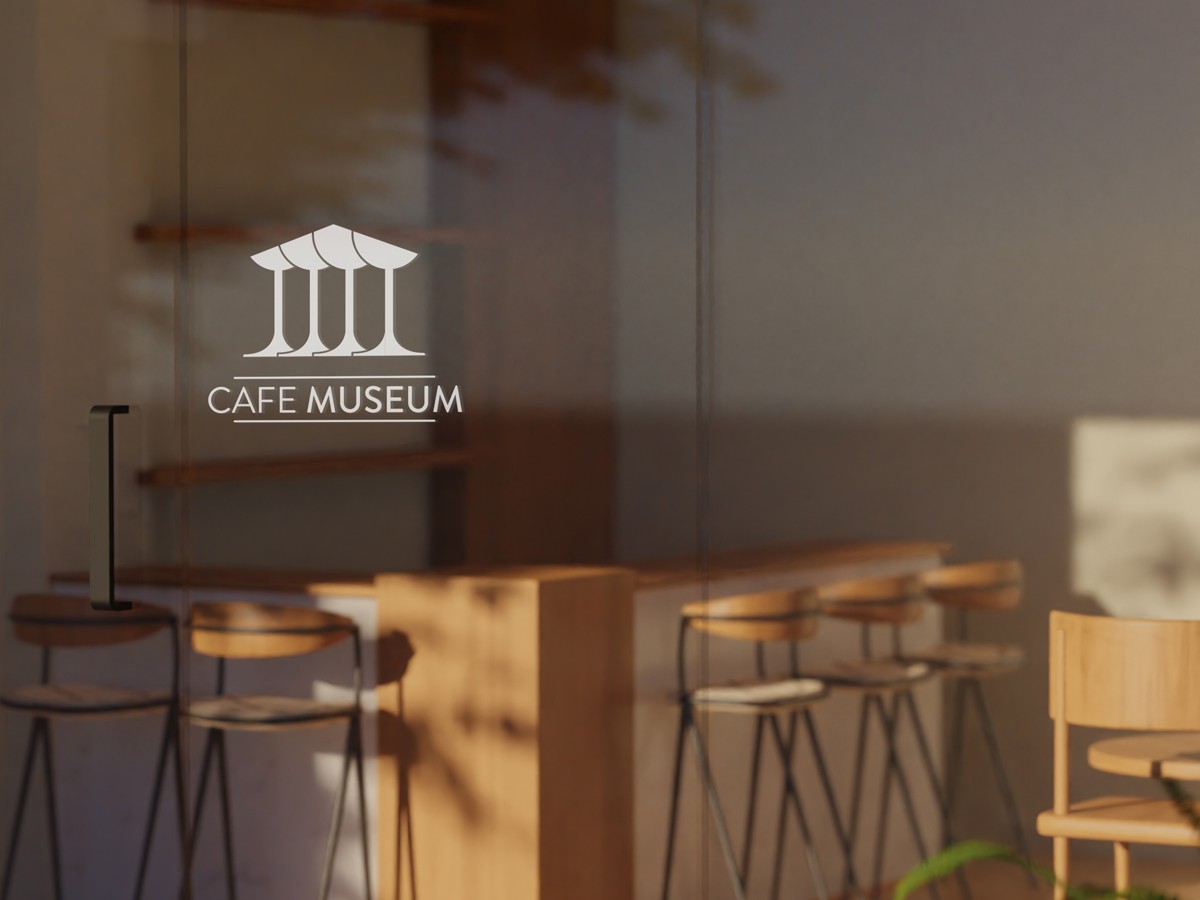
Two rooms in one. A brand that belongs in both.
Culture. Warmth. Restraint.
Rooted in art and heritage.
The visual language borrows from the museum it lives inside — neoclassical proportions, restrained typography, considered detail.
Inviting, approachable, human.
Mocha and dusty rose. Soft contrast, generous spacing. The brand never feels institutional, never feels cold.
Refined without being pretentious.
The mark, the type, the colour — each designed to be confident, not loud. The room speaks louder than the brand.
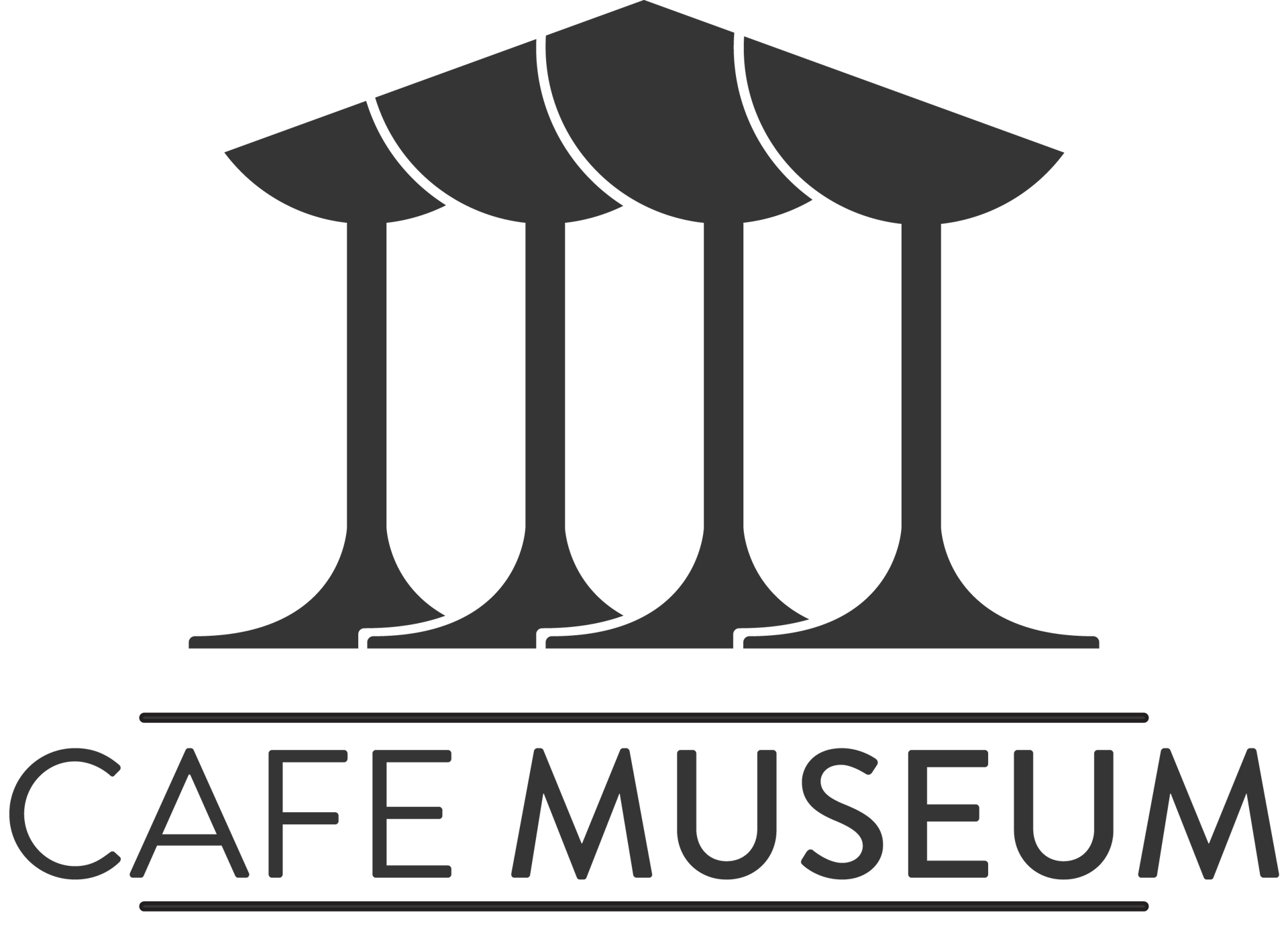
A neoclassical column. The form of a coffee cup. Drawn as one figure.
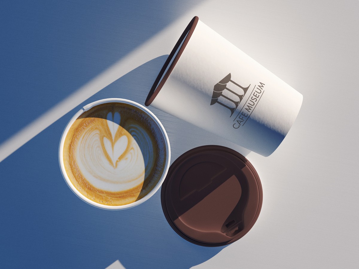
Distinctive on the wall. Quiet on the page.
Display — Viseto
Where culture meets coffee.
Contemporary serif with classical proportions. Used for the wordmark, headlines, and menu names — anywhere the brand speaks first.
Body — Inter
Single origin Ethiopia Yirgacheffe — bright citrus and honey, brewed on the V60. Available all morning.
Neutral sans, light weight. Used for body text, menus, captions, signage. Carries information.
Two palettes. One system.
A warm coffee-inspired set for everyday use, and a deeper refined set for formal and cultural contexts.
Espresso
#4A3728Mocha
#7B5E4BLatte
#A68B7BCream
#D4C4B0Burgundy
#3D2B2BDusty Rose
#8C6B6BMarble
#6B6B6BStone
#E8E2DCPeople notice the brand on a napkin. That's when you know the identity is doing its job.
— Cafe Museum, On the Work