Journal

Working notes on brand design, typography,
and the web.

Essays, opinions, and occasional rants — written between projects. No content calendars, no SEO stuffing, just things I've been thinking about.

Featured image for Reading *The Brand Gap* from a studio of onebrand identity
JUN 2026·6 min read

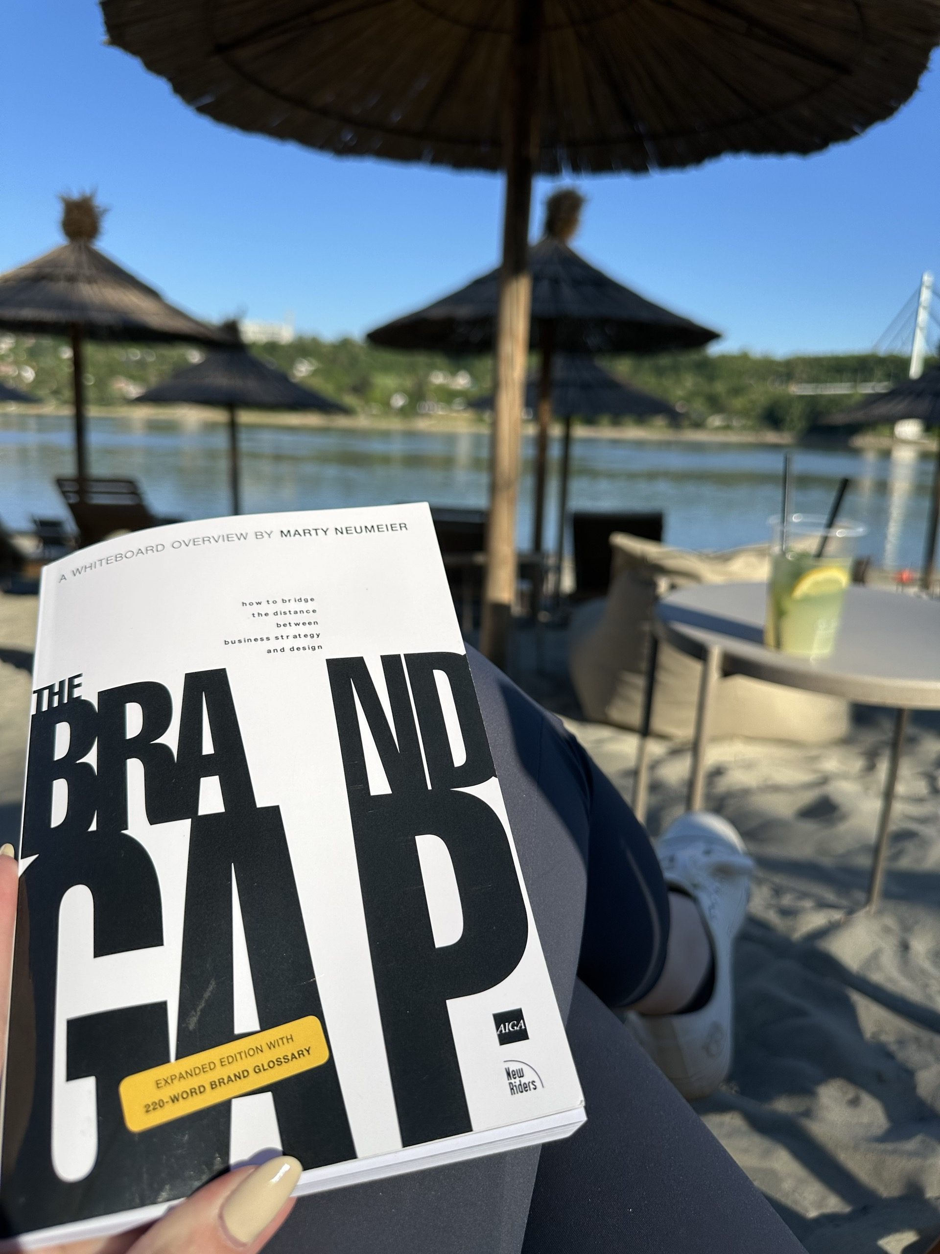
Reading The Brand Gap from a studio of one

Marty Neumeier wrote The Brand Gap for companies with brand departments. I read it with a florist on the phone who is fairly sure a logo is a picture of a flower — and the bones still hold at the scale of a one-room studio.

Read the Article
Featured image for Design from *the inside out.*studio
APR 2026·6 min read

Design from the inside out.

An honest case for working alone, written by someone who isn't entirely sure she'll always work alone — but who knows what would be lost if she didn't.

Read the Article
Featured image for How to hire a designer *without wasting your money.*brand identity
MAR 2026·6 min read

How to hire a designer without wasting your money.

Most working designers are competent. Skill isn't the question. Whether they're the right designer for your project — and whether they think before they decorate — is.

Read the Article
Featured image for Aesthetic is the *cheapest part* of brand identity.brand identity
MAR 2026·6 min read

Aesthetic is the cheapest part of brand identity.

A boutique owner came to me last year with a sentence I've now heard from four other clients. This is what was actually wrong, and what aesthetic alone can't fix.

Read the Article
Featured image for What happens *before the first pixel.*brand identity
MAR 2026·6 min read

What happens before the first pixel.

Most brand identity processes are five steps in different colors. The labels are interchangeable. What changes is how much actually happens inside each.

Read the Article
Featured image for Fonts have accents. *Most brands pick the wrong one.*brand identity
MAR 2026·6 min read

Fonts have accents. Most brands pick the wrong one.

A working designer's argument against the typefaces small businesses keep choosing — and a quieter one for the ones they should.

Read the Article
Still here?

You made it to the bottom. That's usually a good sign.

If something on this page made you think "maybe," I'd rather hear about it than watch you close the tab.


Leave your email to receive updates on new projects and collaborations.

Unsubscribe any time. I won't take it personally.

© 2026 Angela's Studio. All rights reserved.