A brand color is not a color.
A soap maker's green looked different on the box, the card, and the feed. The printer got blamed. What actually went wrong is the same thing that makes famous brand colors famous.

A soap maker sent me two photos last spring, side by side in one message. The first was her new packaging, fresh from the printer. The second was her business card, printed eight months earlier. Both were supposed to be her brand green — the deep, herbal green she'd chosen herself and genuinely loved. In the photos there were, unmistakably, two greens. One leaned blue and cold. The other sat warm and slightly olive. Between them, in the gap, was her brand.
The printer changed my green.
— What the printer did not do
The printer didn't change her green. Nobody changed her green. That's the uncomfortable part: for the printer to have changed it, her green would have had to exist somewhere first — as a definition, a reference, a thing you could point at and say this, exactly this, everywhere. It didn't. What existed was a hex code she'd picked on her laptop one evening, and a series of strangers doing their honest best to guess what she meant by it.
A brand color is not a color. It's a decision about repetition — and most brands never actually make it.
The colors you know with your eyes closed
Think of the brand colors you could identify from a swatch alone, no logo attached. That specific robin's-egg blue on a small square box. That orange. That lilac on a chocolate bar. That brown on a delivery truck.
Tiffany & Co. has used the same blue since the nineteenth century. It's a custom Pantone color — 1837, numbered after the year the company was founded — and it's trademarked. You cannot buy it in the standard swatch book. Hermès didn't choose its orange at all: during the wartime shortages of the 1940s, the only paperboard left was orange, so the cream boxes became orange boxes — and then the company kept repeating the accident, on purpose, for eighty years. Milka has defended its lilac in court, successfully, because a color repeated long enough on a chocolate shelf becomes property. UPS trademarked a brown so unglamorous they eventually built an entire ad campaign around calling themselves Brown.
Here's what none of these colors are: beautiful. Walk into any paint store and you'll find a hundred blues prettier than Tiffany's, a wall of oranges subtler than Hermès'. If you showed the lilac to a room of designers with the brand stripped away, nobody would fight to use it.
These colors are not famous because they were well chosen. They're famous because they were never allowed to drift. The choice was one afternoon. The repetition was a century.
Where the green actually broke
Back to the soap maker. When I audited her color the way I audit everything — screenshot and photograph every surface the brand touches — the failure was easy to reconstruct, and no single person in the chain had done anything wrong.
- The origin The green was picked in a browser, on a laptop, at night. That's a screen color — light, not ink — in whatever state her screen's brightness and warmth happened to be in that evening.
- The print The card printer converted that screen value to ink however their software defaulted. The packaging printer, eight months later, converted it differently, on different paper. Coated stock and uncoated stock drink ink differently; the same formula comes out as two colors.
- The feed Instagram compressed her photos and warmed them slightly, the way phone processing tends to. Her green online was a third green, cousin to the other two.
- The room The bulbs in her shop run warm. Under them, even the "correct" packaging shifted olive by evening.
Every stranger in that chain made a reasonable guess, because a hex code is not a definition — it's a starting point that answers one situation (a screen, roughly calibrated) and stays silent about every other surface a small brand actually lives on.
What a working definition looks like is less glamorous than a mood board. It's a short page: the screen value, the print value for coated and for uncoated paper, the closest standard swatch a local printer can actually match, the version that works on a dark background, and — the rule nobody writes down — the places the color is not allowed to appear. A color that shows up everywhere, tinting every photo and filling every background, stops being a signal. Tiffany doesn't paint the jewelry blue. The box is enough.
How a color earns the job
When a new client and I get to color, they usually arrive with a palette saved from Pinterest. For a few years now it's been the same one — sage green, terracotta, cream — the palette of every candle, every wellness studio, every brand that decided to look calm in 2021. The palette isn't ugly. It's shared. Choosing it is choosing camouflage, and it dates precisely because ten thousand brands chose it in the same eighteen months.
So we don't start from palettes. We start from the positioning work — who the brand is for, what it's against, what it should feel like in the hand — and then I go looking for a color that can carry that sentence alone, without the logo helping. And before anything gets approved, the candidate color has to survive four deliberately ugly tests:
- The cheapest paper I print it on flyer stock from a strip-mall copy shop. If the color only works on premium coated paper, the brand can't afford its own color.
- The tired phone I look at it on a phone at minimum brightness with night mode on. That's how half her customers will first see it — not on my calibrated monitor.
- The shelf I place it next to the competitors — actual photos of the actual shelf, the actual feed, the actual market stall. A color that's tasteful in isolation and invisible in context has failed.
- The phone call Someone should be able to describe it over the phone to a sign-maker and get roughly the right thing back. "Deep herbal green, darker than olive, no blue in it." If the color needs a screen to be explained, it will drift every time it travels.
A color that passes all four is rarely the prettiest candidate. It's the most repeatable one. And repeatable is the entire job — because the soap maker's customers will never see her green the way she saw it that first night on her laptop. They'll see it on a box under warm bulbs, on a compressed photo, on a card pulled from a coat pocket. The brand is whatever survives all of that.
She didn't need a prettier green. She needed one green.
Now she has it — on the box, on the card, on the feed. The same decision, everywhere.
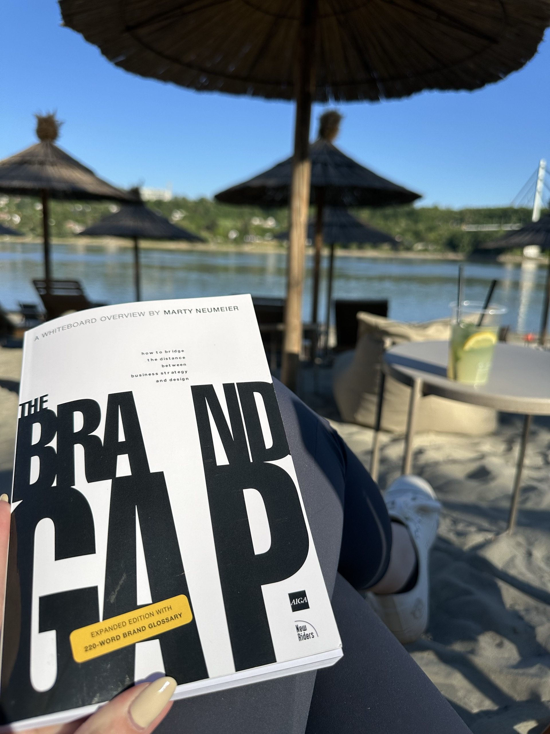
Reading The Brand Gap from a studio of one
Marty Neumeier wrote The Brand Gap for companies with brand departments. I read it with a florist on the phone who is fairly sure a logo is a picture of a flower — and the bones still hold at the scale of a one-room studio.
Read the Article →
Design from the inside out.
An honest case for working alone, written by someone who isn't entirely sure she'll always work alone — but who knows what would be lost if she didn't.
Read the Article →
How to hire a designer without wasting your money.
Most working designers are competent. Skill isn't the question. Whether they're the right designer for your project — and whether they think before they decorate — is.
Read the Article →