Make it pop is not feedback.
The single most expensive sentence a client can say arrives in round two, and it's almost always three words long. What good feedback actually sounds like, from the other side of the file.

The first round of a project is mine. The client hands me the brief, I disappear for a while, and I come back with something to react to. That much is easy. The work doesn't get good in round one. It gets good in round two — and round two belongs to the client. Which is why the sentence that arrives at the start of it decides almost everything.
Last year a client opened round two by looking at three logo directions for a full minute, then saying the thing I've now heard in some form on nearly every project I've run.
I like it, I just want it to pop more.
— The most expensive three words in the process
I've stopped flinching when I hear it. It isn't a bad client saying it — it's usually a thoughtful one, someone who can feel that something is missing and is reaching for the only vocabulary anyone ever gave them for design. But "make it pop" is not feedback. It's a sensation wearing the costume of an instruction. And if I act on it literally, I make the work worse, because the only thing I can reliably do with "pop" is turn something up: more contrast, a louder color, a bigger mark. Louder is not the same as better, and it is almost never what the person actually wanted.
Feedback and instruction are not the same thing
Here is the distinction I wish every client arrived knowing. An instruction tells me what to do: make the logo bigger, use the blue from the website, remove the tagline. Feedback tells me what you experienced: this feels colder than we are, the eye doesn't know where to land, it looks like the company down the street.
Instructions are easy to follow and easy to get wrong, because the client is now doing my job — choosing the solution — usually without the training that makes the choice a good one. Feedback is harder to give and far more useful, because it hands me the problem and leaves the solving to the person you hired to solve it. When a client tells me the mark feels like it belongs to a law firm and we're a bakery, I have somewhere to go. When a client tells me to make the mark bigger, all I've learned is that they've already decided size is the issue. Nine times out of ten, size is not the issue.
The best clients I've worked with describe the gap, not the fix. They tell me where the work missed and trust me to close the distance. The hardest projects are the ones where the feedback arrives pre-solved, a list of adjustments handed down like a work order, every one of them a small guess about a craft the client doesn't practice.
Reaction is real, but it isn't direction yet
None of this means the client's first reaction is worthless. It's the opposite — the reaction is the most honest data in the whole process. When someone glances at a draft and their face falls for half a second before they say something polite, that half-second is true. My job in round two is to get underneath the reaction to the thing causing it.
So when I hear "make it pop," I don't reach for the contrast slider. I ask questions:
- What were you hoping to feel when you saw it that you didn't?
- Is it that this feels too quiet, or that it feels like someone else's brand?
- Point at the version that's closest, even if none is right. What's closer about it?
- If you showed this to your favorite customer, what's the worst thing they might think?
Almost every time, three words open into something usable. "Pop" turns out to mean I'm afraid it looks cheap. Or my competitor's is bolder and I'm scared of disappearing next to them. Or, most often, I don't feel anything and I expected to. Those are real problems, and none of them is solved by making the logo louder. Some are solved by making it quieter. Aesop does not pop. Le Labo does not pop. They hold. That's a different instruction entirely, and I can only get to it if we throw the first sentence away and find the real one underneath.
Design by committee is where feedback goes to die
The other thing that quietly ruins a round of feedback is the number of people in it. A founder shows the drafts to a partner, a spouse, three friends, and the loudest person on the team, then forwards me a document that reads like the minutes of an argument. One voice wants it bolder, one wants it softer, one wants the color from a brand they admire, one just doesn't like green. I'm now asked to satisfy a committee that will never be in the same room, and the only shape that satisfies all of them at once is a shape with every distinctive edge sanded off.
A brand designed to survive a committee is a brand designed to be forgotten. The averaging is the damage. Every strong choice is somebody's least favorite, so consensus feedback deletes exactly the parts that would have made the brand memorable. The Mailchimp rebrand — the yellow, the wonky illustration, the winking weirdness — is not what you get when eleven people vote. It's what you get when one person with taste decides and defends it.
I'm not asking a client to have no advisors. I'm asking for one decider. Gather all the reactions you want, then have a single person metabolize them into direction and send me that. A brand is a gut feeling, and a committee does not have a gut.
What good feedback actually sounds like
If you're ever on the client side of a design file — mine or anyone's — here is what makes a designer's next round dramatically better, and none of it requires you to know a thing about typography or color.
- Say what you feel before you say what to change. "It feels stiff" is worth more than "use a rounder font." Give me the symptom; let me find the cause.
- Point at what's working, specifically. If you only flag problems, I don't know which parts to protect, and I'll accidentally fix the thing you loved.
- Rank, don't scatter. Tell me the one thing that matters most. Ten equally weighted notes force me to guess your priorities, and I'll guess wrong.
- Bring the fear, not just the fix. "I'm worried we look like the franchise across the street" tells me what you're actually protecting. That sentence is worth an hour of adjustments.
- Let a draft be a draft. The first round is a question, not a proposal. React to the direction, not the kerning. We polish the pixels once we agree on the shape.
A client who does even two of these gets noticeably better work, not because I try harder — I'm already trying — but because I finally know where to aim.
The truth I've learned across nine years of files going back and forth is that the ceiling on the work is not my skill. It's the quality of the conversation about the work. I can only design as well as I'm allowed to understand.
Make it pop is not feedback. It's a door.
Tell me what's behind it, and I'll build you something that doesn't need to shout.

A brand color is not a color.
A soap maker's green looked different on the box, the card, and the feed. The printer got blamed. What actually went wrong is the same thing that makes famous brand colors famous.
Read the Article →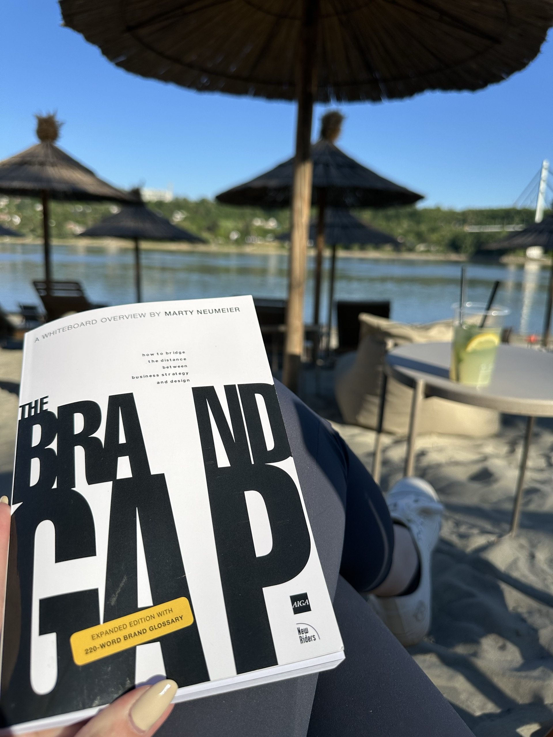
Reading The Brand Gap from a studio of one
Marty Neumeier wrote The Brand Gap for companies with brand departments. I read it with a florist on the phone who is fairly sure a logo is a picture of a flower — and the bones still hold at the scale of a one-room studio.
Read the Article →
Design from the inside out.
An honest case for working alone, written by someone who isn't entirely sure she'll always work alone — but who knows what would be lost if she didn't.
Read the Article →