Design is what you leave out.
A bakery owner handed me a flyer with forty products, three fonts, two phone numbers, and a QR code on it. She wanted me to make it look professional. The professional version had less on it, and that was the whole fight.

A bakery owner sent me a flyer last autumn and asked me to make it look professional. It was one A5 page. On it, at the same time, were forty products with prices, two phone numbers, an address, opening hours for two locations, a tagline, a second tagline underneath the first, three fonts, a QR code, four social media icons, a photo of the shopfront, a photo of a croissant, and a starburst that said NEW. Nothing was wrong with any single thing on the page. She had put a lot of care into it. That was the problem.
Can you just make it look more professional?
— What she asked
The version I sent back had maybe a third of what she started with. One phone number. One address. Eight products, not forty. One font. No starburst. She looked at it and asked, politely, whether I'd forgotten to finish it.
The hardest thing to sell a small business is empty space. Not a logo, not a color, not a font — those are things you can point at and feel you got your money's worth. Empty space feels like the thing you paid a designer to fill and they didn't.
Why more feels safer
I understand the instinct completely, because it isn't a design instinct. It's a business instinct, and it's a reasonable one.
If you run the bakery, every one of those forty products is something you'd like to sell. Every phone number is a way for someone to reach you. The QR code might get one more follow. The second tagline says something the first one missed. Leaving anything off the flyer feels like leaving money on the table — a customer who would have bought the fifth thing, if only they'd seen it.
So the page fills up. Not out of bad taste. Out of hope. Each element is a small bet that this is the one that lands, and when each bet is nearly free to place, you place all of them.
Here's the part that's hard to feel from the inside: every element you add costs you the ones already there. Attention isn't a resource the reader brings in unlimited supply and spends element by element. It's a fixed, small budget, and the page divides it. Forty products don't give the customer forty chances to buy. They give the customer a wall, and a wall gets skimmed and set down.
What restraint is actually doing
When I take things off a page, I'm not making it emptier. I'm deciding where the reader looks first, and second, and whether there's a third at all. That is the entire job. Layout is just the management of attention, and you can't manage attention you've already spent.
The eight products I kept weren't the eight cheapest or the eight newest. They were the eight that told the customer what kind of bakery this was in one glance — the ones that, seen together, added up to a personality. The other thirty-two weren't deleted because they were bad. They were deleted because they were competing with the point.
This is the sentence I end up saying, in some form, to almost every client:
A page that says everything says nothing. A page that says one thing gets remembered.
— ANGELA'S STUDIO
The brands a small business owner admires — the ones that look expensive, calm, sure of themselves — are not richer in elements. They are poorer in them, on purpose. Muji built an entire global identity on the refusal to print a logo on the product. Apple's packaging is mostly the box. Dieter Rams designed for Braun for decades under a principle he wrote down as less, but better, and you can still feel it in every device that quotes him without credit. None of these look effortless because someone added the right final touch. They look effortless because someone had the authority to remove the last ten.
Subtraction is the expensive skill
Anyone can add. Adding is what happens when no one decides. You open the file, you have a new thing to say, you find a corner, you put it in. The flyer that arrives in my inbox with forty products on it is not the product of design — it's the product of no one ever having said no.
Subtraction is the part you're actually paying a designer for, and it's the part that's hardest to charge for, because the finished work doesn't show its labor. When I take thirty-two products off a page, the invoice can't point to them. They're not there. The client sees eight products and a lot of white and quietly wonders what took ten hours.
What took ten hours was the deciding. Which eight. In what order. What the reader should feel in the first second, and what to remove so that feeling survives. The white space isn't the absence of work. The white space is where the work went.
"But my competitor's flyer has everything on it"
They sometimes do. And you can look at a competitor's crowded flyer and read it as evidence that crowding works — they're still in business, aren't they?
But you're not comparing the crowded flyer to a calmer version of the same flyer. You never get to see that. You see one artifact and assume it's the cause of whatever's happening. The bakery down the road might be busy despite its flyer, on the strength of location or word of mouth or twenty years of regulars. Their flyer isn't a strategy you can copy. It's a thing they also happen to have.
The question is never "what does everyone else's look like?" It's "what do I want the person holding this to do next?" If the answer is one thing — come in on Saturday, try the new loaf, remember the name — then the page should be built to make that one thing unmissable, and everything that isn't that one thing is in its way.
What changed for the bakery
She ran both versions, in the end. Her instinct wasn't wrong to test — mine is a claim, not a law. The forty-product flyer went out one week. The eight-product one went out the next, same print run, same neighbourhood.
She didn't send me sales figures, and I wouldn't trust them at that sample size anyway. What she sent me was quieter and more telling. People had started coming in and asking for the loaf on the flyer — the loaf, the one thing the calm version had put at the center with room to breathe around it. On the crowded flyer, that same loaf had been there the whole time, product number twenty-three, priced and photographed and completely invisible.
Nothing had been added to make it visible. Something had been taken away from around it.
What this means if you're paying for design
If a designer hands back everything you gave them, arranged more neatly, you paid for arrangement. Arrangement is real, but it's the cheap half of the job. The expensive half is the argument about what shouldn't be there at all — and a designer who won't have that argument with you, who says yes to the fifth font and the second tagline and the starburst because the customer is always right, is not saving you a fight. They're spending your attention budget on your behalf and handing you the bill.
Ask for the version with less on it. Then ask why each thing that survived, survived.
The full page is what you brought me.
The empty space is what I was for.

Make it pop is not feedback.
The single most expensive sentence a client can say arrives in round two, and it's almost always three words long. What good feedback actually sounds like, from the other side of the file.
Read the Article →
A brand color is not a color.
A soap maker's green looked different on the box, the card, and the feed. The printer got blamed. What actually went wrong is the same thing that makes famous brand colors famous.
Read the Article →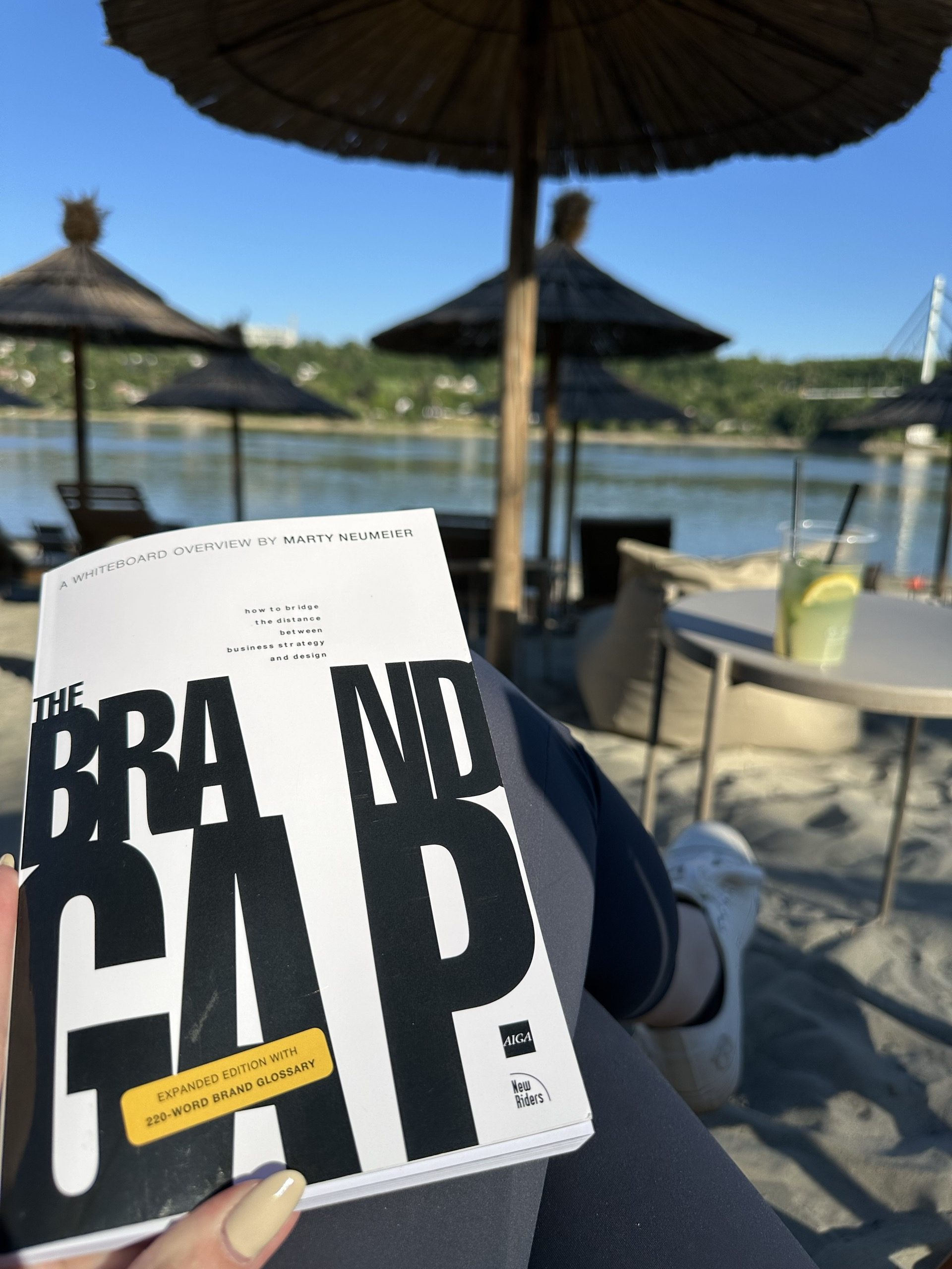
Reading The Brand Gap from a studio of one
Marty Neumeier wrote The Brand Gap for companies with brand departments. I read it with a florist on the phone who is fairly sure a logo is a picture of a flower — and the bones still hold at the scale of a one-room studio.
Read the Article →