What happens before the first pixel.
Most brand identity processes are five steps in different colors. The labels are interchangeable. What changes is how much actually happens inside each.
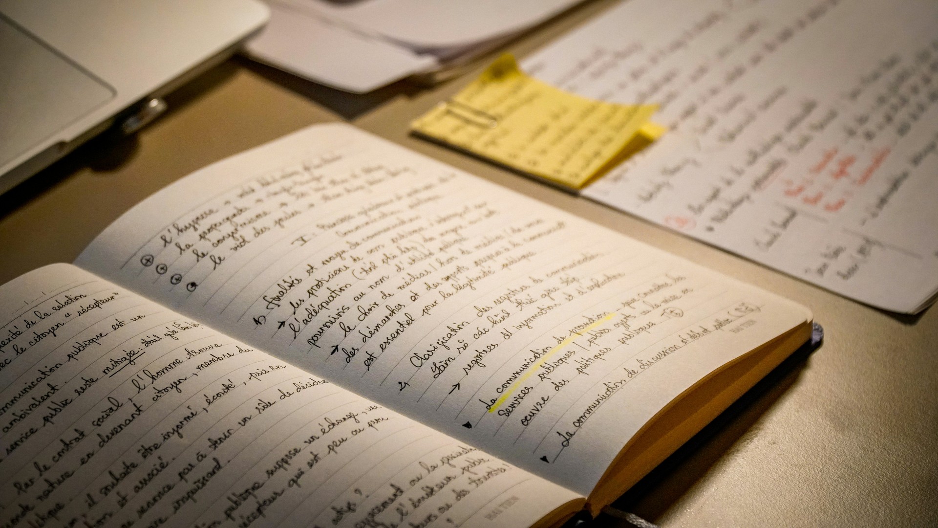
The first hour with a client decides everything that follows. Not because of what I show them — I don't show anything yet — but because of what I ask. Most kickoff questions are useless. The ones that work are the ones founders haven't been asked before.
Discovery is the only stage where I don't open the laptop
The first hour with a client is a conversation, not a kickoff. I ask questions and write down the ones the client paused on. The pauses are the deliverable.
The standard kickoff questions are useless. "Who is your target audience?" produces a description of everyone who might buy something. "What's your brand personality?" produces five adjectives that could describe any business in any industry. Friendly, professional, modern, authentic, approachable. Those words don't help me design anything.
The questions I find most useful instead:
- What did you last buy online, and why that one over the alternatives? This tells me what your purchasing logic is, which is the same logic your customers will use on you.
- Who is the customer you'd quietly turn away if you could? More useful than describing your ideal customer. Negation is sharper than aspiration.
- If you closed in two years, what's the specific thing your regulars would say they miss? This pulls out the texture of the brand the founder usually can't articulate when asked directly.
- What's a competitor whose work you respect, and what specifically do they do well? Founders rarely lie about this, and the answer reveals their own taste before any visual reference is shown.
Most discovery forms ask about adjectives and target markets. The forms produce the same answers regardless of business: friendly, professional, modern, authentic, women aged 25–45 with disposable income. Those answers are not material I can design from. The pauses are.
Research is mapping, not inspiration
The next stage is not gathering things I like. It's mapping the field the brand will live in.
For a florist project, I'll look at twenty to thirty florists in adjacent markets — Berlin, Vienna, Copenhagen, Tokyo, Melbourne. Not for ideas. For patterns. By the end I can tell you what color the median European florist site is (sage or muted terracotta), what typeface is most common (a soft serif with optional ligatures), what photography style dominates (overhead flat lays in natural light, mid-tone). You can't know what original looks like in your space until you know what unoriginal looks like.
The research file is forty screenshots in three buckets. The third bucket — brands outside the category — is where the real material is.
— ANGELA'S STUDIO
The research file is usually about forty screenshots organized into three buckets: what most of the category does, what a few outliers do, and what brands outside the category do that I want to borrow from. The third bucket is where the real material is. A florist whose visual identity is more influenced by a Japanese bookstore than by other florists is going to be more memorable than one referencing Pinterest's "florist" tag.
Sketches are slower than software for a reason
Paula Scher told the story of designing the Citi logo on a napkin during her first client meeting. The story gets told as if she got lucky. What she actually said next was that the napkin was the visible end of decades of thinking about banks, mergers, and language.
I sketch in pencil because pencil makes you commit. Software gives you infinite undo, infinite color choices, infinite type combinations. You start picking before you know what you're picking for. Pencil eliminates options by making them physically expensive to produce. You can only draw so many bad shapes before you start drawing better ones.
Most of what I sketch never gets shown to the client. That's the point. The bad ideas have to exist on paper before the good ones can be recognized.
Design is when the system has to hold
When I move into Figma, the goal isn't a logo. The goal is a system that scales. Type at six sizes. Color at five values for each hue. Spacing on a four-pixel grid. Photography rules. Voice rules.
The mark itself is usually about ten percent of the work. Most of the time goes into deciding how the mark behaves — what happens when it's on a coffee cup, on a small mobile favicon, on a printed receipt, in a black-and-white newspaper ad. A logo that only works at one size in one context isn't a logo. It's an illustration.
Every decision at this stage is a decision about every future decision. The typeface I choose now will live on every email signature, every invoice, every storefront sign for the next decade. The color has to work in print, on screen, against a white background, against a photograph, in a tiny favicon, blown up across a wall. The grid I set will determine the rhythm of how the brand reads on every surface it ever touches.
Delivery is mostly teaching
The last stage is files plus a guide. The files are the smaller part. The guide is what determines whether the brand survives the year after the project ends.
Most clients have never used a brand system before. Without a guide, they will make decisions in week three that contradict decisions I made in week eight, and within six months the brand will look like four brands stitched together. The guide isn't about restricting them. It's about making the system reusable without me in the room.
A logo can be drawn in an afternoon.
The system around it is what makes the logo worth paying for.
Fonts have accents. Most brands pick the wrong one.
A working designer's argument against the typefaces small businesses keep choosing — and a quieter one for the ones they should.
Read the Article →
Nobody reads your logo. They read your words.
A physiotherapist paid me to redesign her logo. The first line on her website still said 'Welcome to our website.' We fixed the wrong thing first, and most small businesses do too.
Read the Article →
Design is what you leave out.
A bakery owner handed me a flyer with forty products, three fonts, two phone numbers, and a QR code on it. She wanted me to make it look professional. The professional version had less on it, and that was the whole fight.
Read the Article →