Aesthetic is the cheapest part of brand identity.
A boutique owner came to me last year with a sentence I've now heard from four other clients. This is what was actually wrong, and what aesthetic alone can't fix.
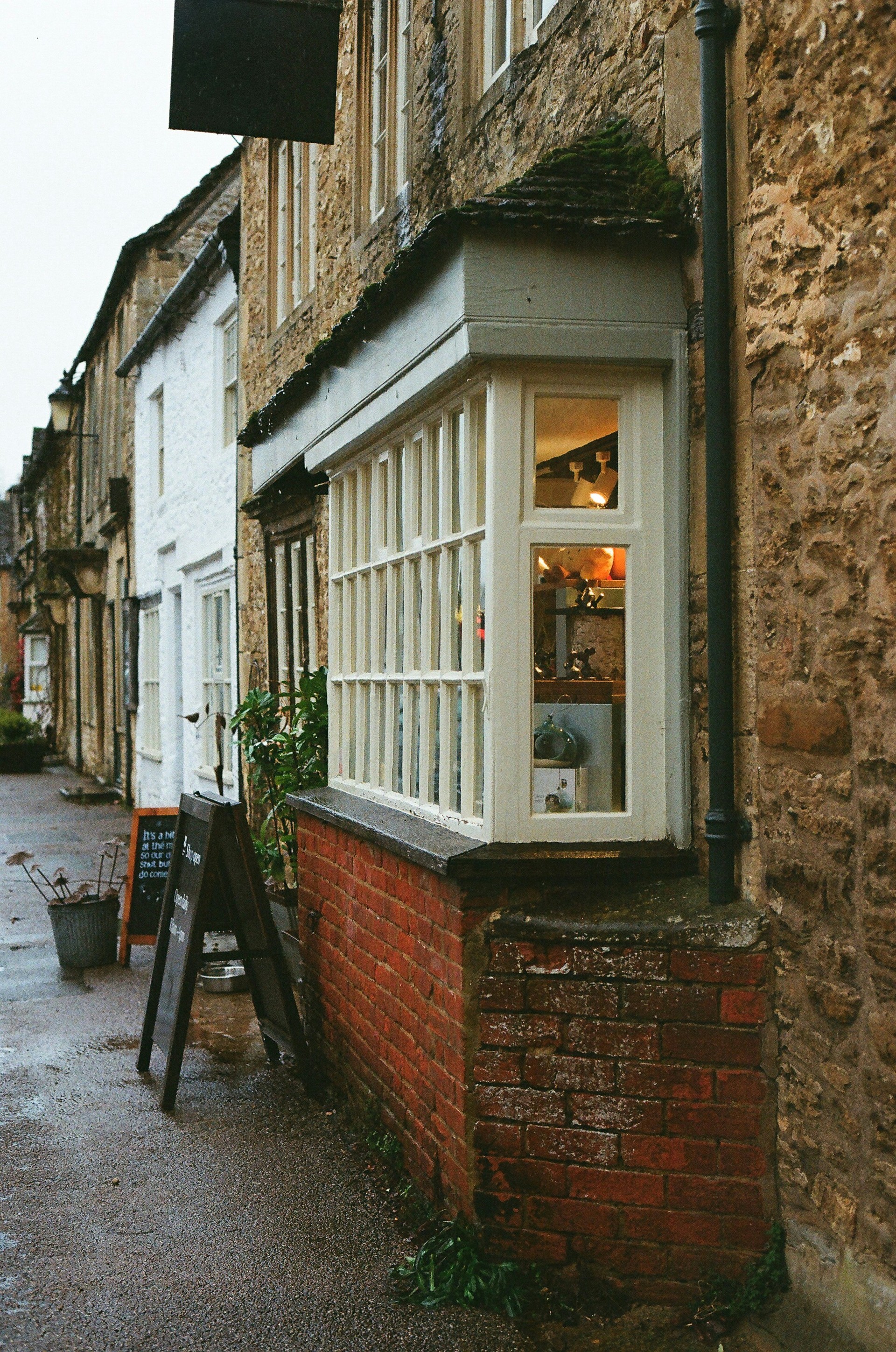
A boutique owner sat across from me last year and said something I've now heard, in slightly different words, from four other clients. She was the third small business owner that month to describe the same problem. It took me a few projects to understand it wasn't really a problem about how things looked.
It looks different everywhere and I don't know why.
— What she actually said
She had paid a designer the year before. The work she got back was, in isolation, not bad. The logo was fine. The colors were okay. The font choice was reasonable. Each piece, looked at on its own, was something a competent designer could have made.
The problem started when the pieces had to live next to each other.
Aesthetic is the cheapest part of brand identity, because it's the part you can buy from a Canva template at four in the morning. What's expensive is everything aesthetic is supposed to be sitting on top of.
What I found when I looked
Before I propose anything to a new client, I do an audit. I open every place their brand currently exists and screenshot it. The website. Instagram. The shop sign. Business cards. Email signatures. Receipts. Packaging. Any printed material, any digital surface.
For her, the audit took about an hour. Here's what was on the table by the end:
- The logo The website used one version. Instagram used a different version, slightly modified to fit a circle. The shop sign used a third version, redrawn by the sign-maker because the original file didn't enlarge well. Business cards used a fourth.
- The typography The website was set in a thin serif. Instagram captions used a sans-serif. Printed receipts used whatever font the printer's template defaulted to. Each surface had its own typographic voice.
- The colors The website's beige was warm and yellow-leaning. The Instagram template's beige was cool and gray-leaning. Neither matched the actual paint color on the shop wall.
- The system There wasn't one. No guide, no rules, no reference for what the brand was supposed to look like. Every new asset was a decision made from scratch, by whoever happened to be making it that day — sometimes her, sometimes a friend, sometimes a freelancer.
None of these were ugly individually. The problem was that customers don't experience a brand individually. They experience it as a flow — they see the Instagram post, then walk into the shop, then take home a bag with a card inside, then get an email follow-up. Each touchpoint was speaking, but they were all speaking different languages.
That's what she meant by "it looks different everywhere." The aesthetic of any single piece wasn't the failure. The system was. There wasn't one.
What clients mean when they say aesthetic
When a small brand owner says "I want it to look more aesthetic," what they're usually responding to is a specific feeling: their brand looks effortful, and the brands they admire look effortless. The diagnosis is correct. The treatment they're asking for is not.
Effortless in branding is almost always the visible result of an enormous amount of decision-making upstream. The brand they admire isn't aesthetically richer. It's strategically clearer, and the aesthetic is what fell out the bottom of that clarity.
Aesop looks effortless because they decided fifteen years ago to position skincare as apothecary, and every typographic, photographic, and architectural choice has been a downstream consequence of that one positioning sentence. Le Labo looks effortless because they decided to write the city name on every bottle in a typewriter font, and once that decision exists, the rest of the brand is a series of choices that either agree with it or don't.
You can't reverse-engineer this by adopting the surface. You can copy the cream and the serif and the linen napkin and end up with something that looks like Aesop and means nothing.
Why "more design" doesn't fix this
Her instinct, when we first talked, was that she needed a new logo. A nicer one. Something more modern, more elegant, more her. She'd already been on Pinterest collecting examples.
This is the most common response to brand incoherence, and it almost always makes things worse. Adding a fifth version of a logo to four inconsistent surfaces gives you five inconsistent surfaces. The aesthetic gets prettier. The brand stays fragmented.
What she actually needed was the boring part. The part that doesn't post well on Instagram. The part nobody pays for proudly.
She needed rules.
What I built instead
The new identity took about ten weeks. The logo design — the part she had been most excited about — was maybe a quarter of the work. The other three quarters were the parts she didn't know to ask for:
One single logo file with clear rules for when to use the full version, when to use the symbol alone, and what minimum size each could appear at. Three approved color values, with hex codes, CMYK conversions for print, and physical paint references for the shop. Two typefaces — one for headlines, one for everything else — with sizes locked at six specific points she could choose from. A grid for Instagram so every post automatically belonged to the same family. A short voice guide so her captions stopped sounding like five different people had written them.
The aesthetic was the easy part. The system was the work.
— ANGELA'S STUDIO
What changed for her, and what didn't
Six months later, her sales hadn't doubled. Brand identity isn't a marketing campaign — that's not what it does. What changed was quieter, and more useful.
She stopped having to think every time she made something. The Instagram post template was already there. The email signature was already set. When she ordered new packaging, she sent the printer one file with one set of specifications, and the result matched the shop sign without anyone having to redraw anything.
She stopped getting the question "who is this from?" when she sent things in the mail. Customers started recognizing her packaging before they read the label. That recognition — invisible to her, automatic for them — is the actual product of brand identity work.
And the conversation she'd had with me a year earlier — "it looks different everywhere" — stopped being something she said about her business.
What this means if you're paying for branding
If a designer offers you a logo, a color palette, and a font without offering you a system, you're being sold the cheapest part of brand identity at the highest visible price. The files will look fine. They will not survive contact with your business.
The question to ask isn't "what will my brand look like?" The question is "what will I do six months from now when I need a new piece of packaging, or a new social media graphic, or a new sign for the window?"
If the answer is "I'll figure it out then," you don't have a brand identity. You have aesthetic decisions waiting to fragment.
If the answer is "I'll open the file the designer gave me and follow the rules," you have a brand identity that will still be coherent in five years, in ten, in twenty.
Aesthetic is what people see first.
The system is what makes them remember it tomorrow.
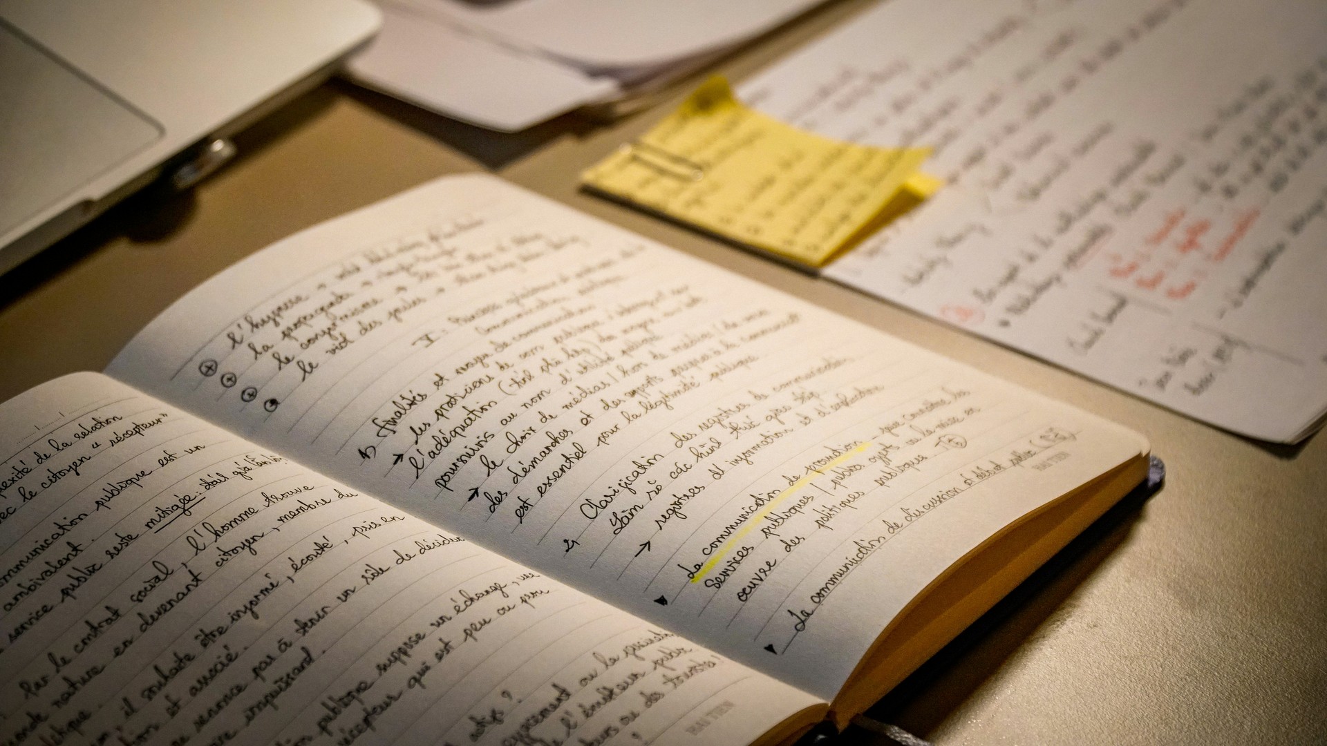
What happens before the first pixel.
Most brand identity processes are five steps in different colors. The labels are interchangeable. What changes is how much actually happens inside each.
Read the Article →
Fonts have accents. Most brands pick the wrong one.
A working designer's argument against the typefaces small businesses keep choosing — and a quieter one for the ones they should.
Read the Article →
Nobody reads your logo. They read your words.
A physiotherapist paid me to redesign her logo. The first line on her website still said 'Welcome to our website.' We fixed the wrong thing first, and most small businesses do too.
Read the Article →