Molekul food & soul labScience meets soul.
A sweet shop with a chemistry name and an emotional core. We built a brand that holds both — clinical and warm, precise and playful, lab and lullaby.
Molekul Food & Soul Lab is a Novi Sad sweet shop where waffles, cremes, and desserts get composed like formulas. The brand had to honor the name's two halves — the lab on the left, the soul on the right. We built a system that lets the science feel warm and the warmth feel considered, with a black molecular mark anchoring rainbow gradient surfaces and bold typographic posters carrying the emotional voice.
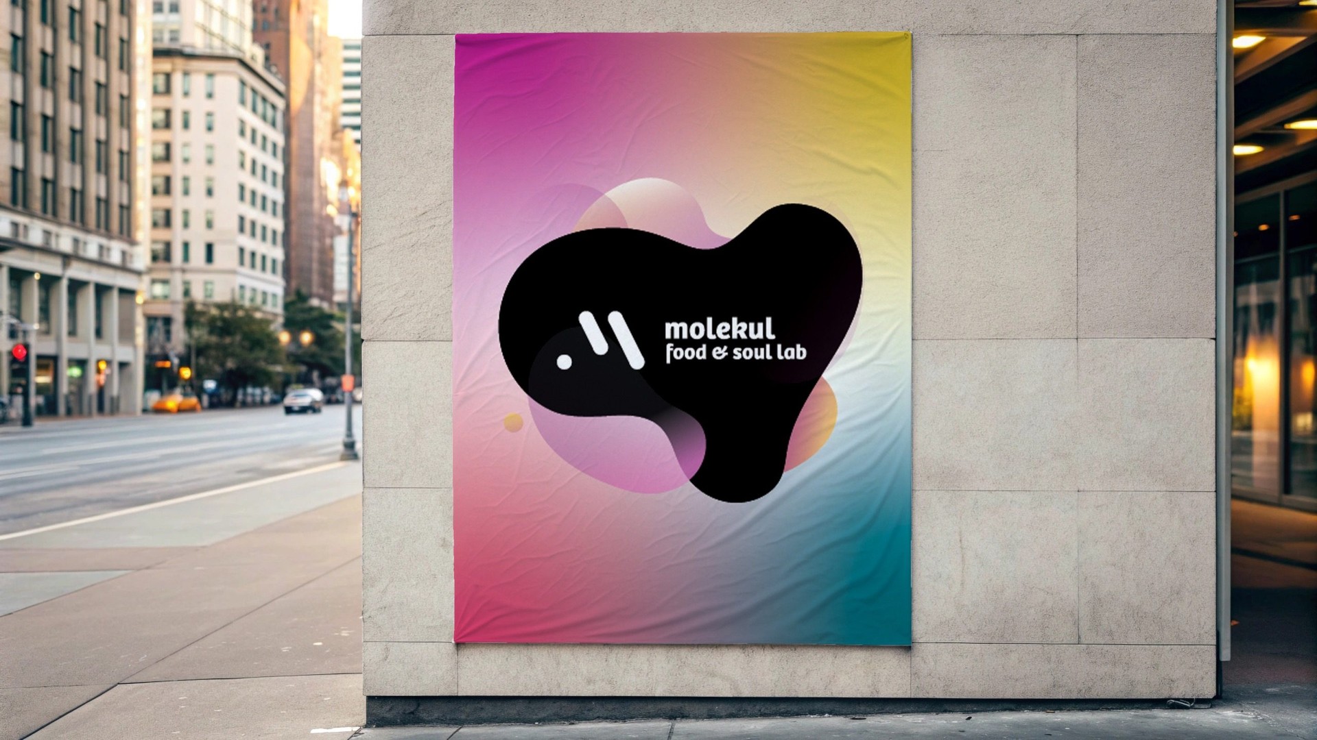
A sweet shop. That sounds like a science.
One mark. One palette. Two moods.
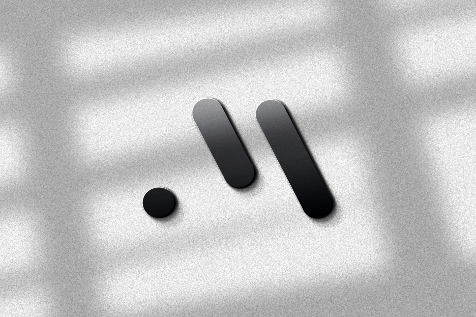
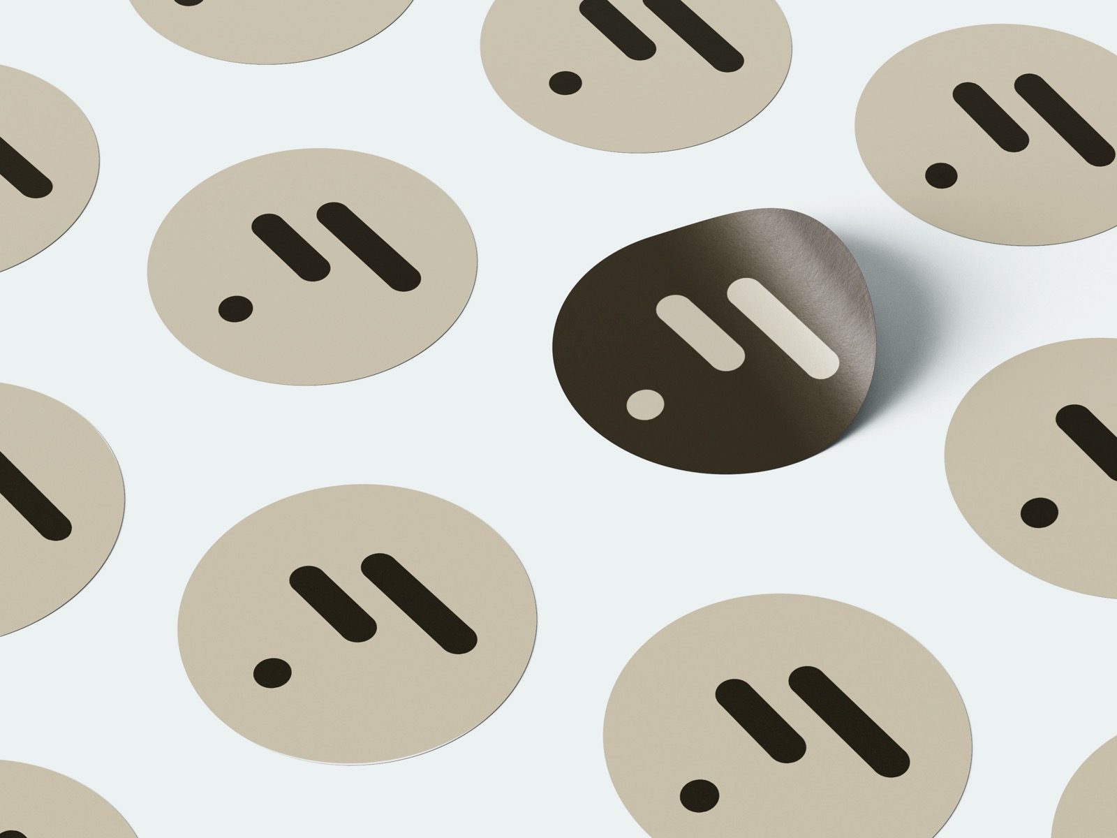
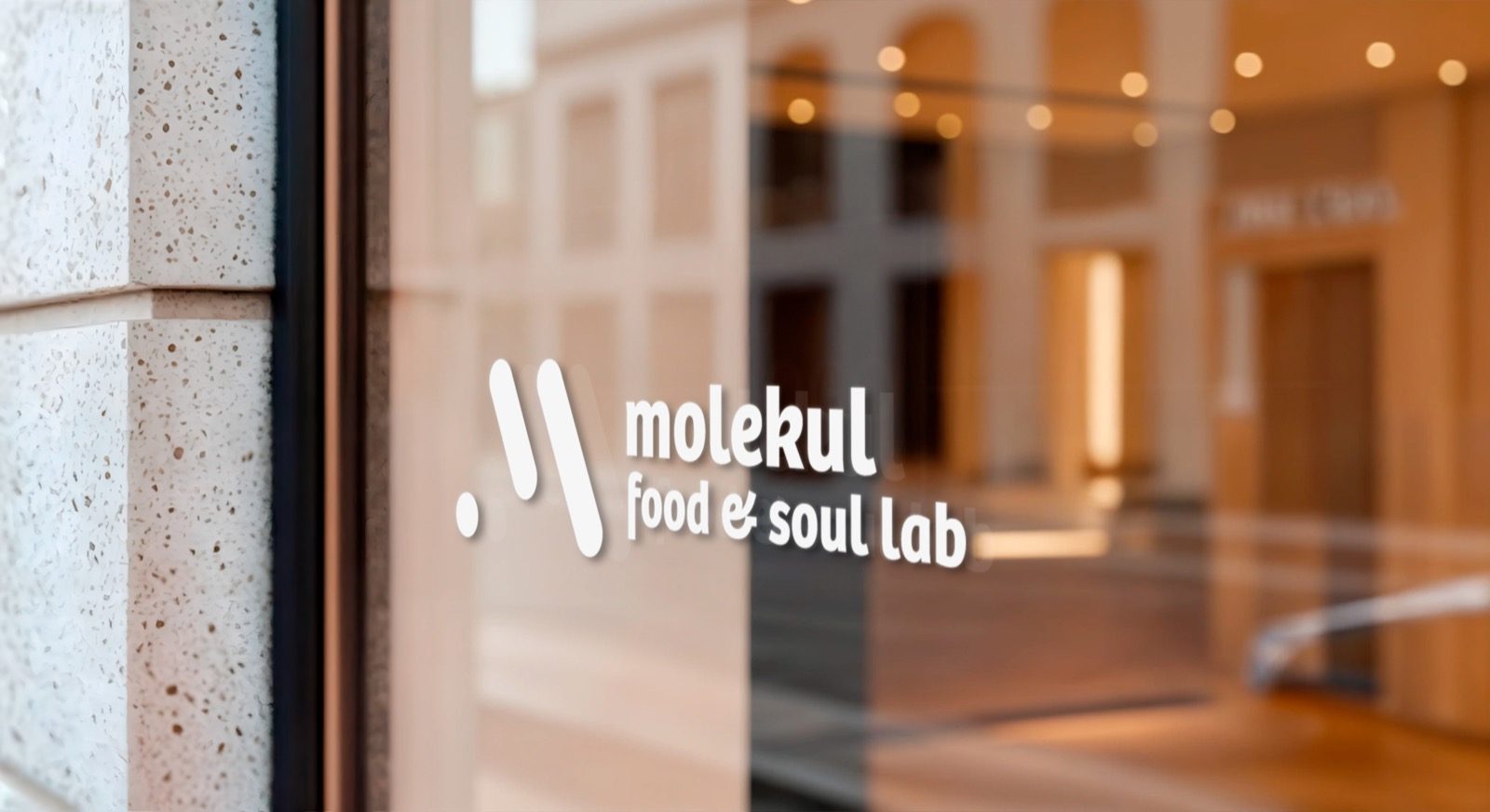
A black mark, drawn precise.
The logomark reads as molecular — two pills and a dot, like an atom diagram or a piece of musical notation. Black, geometric, considered. The scientific half of the brand.
A gradient of feelings.
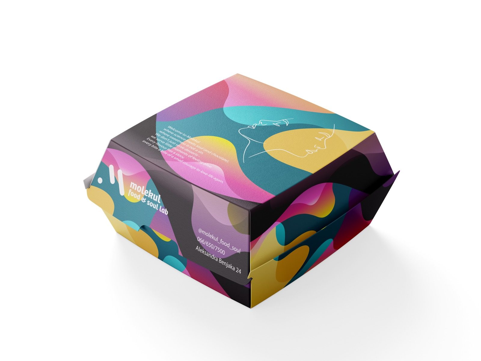
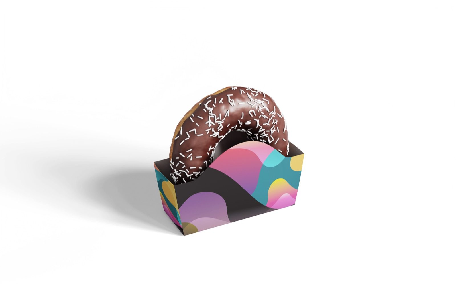
Pink, coral, yellow, teal, blue — soft painterly gradients that wash behind the black mark. Never primary, never harsh. The emotional half of the brand.
Affirmations, not advertising.
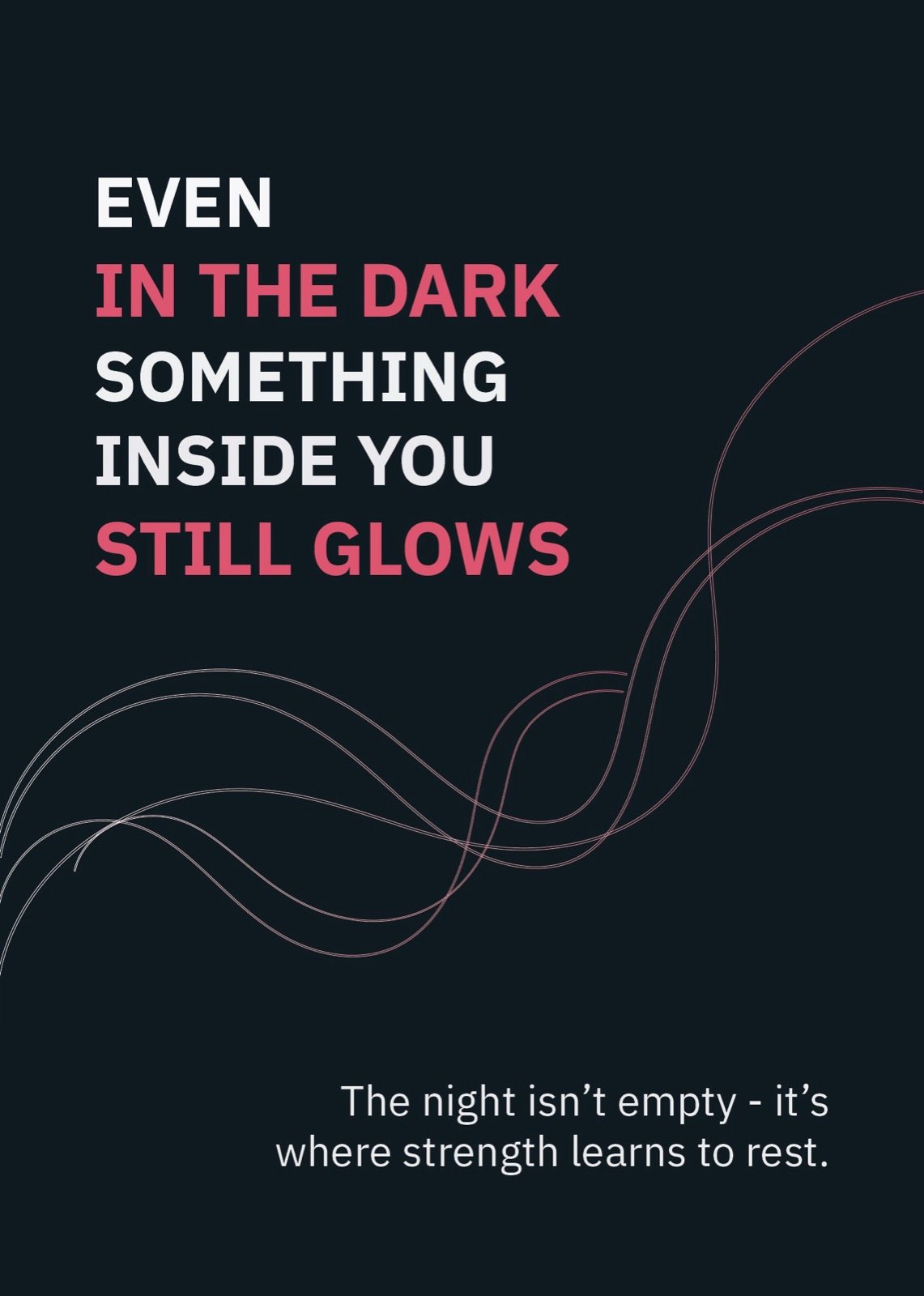
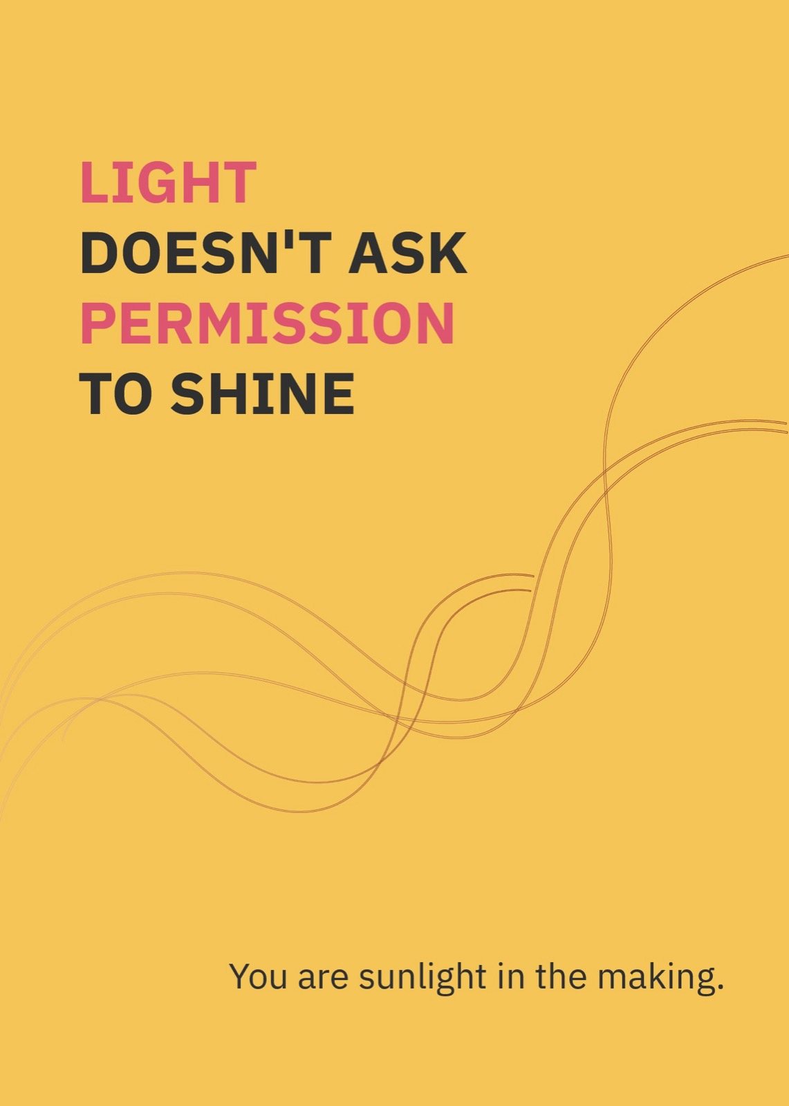
"Where sweetness is not a sin." "We don't just serve desserts — we serve little moments of feeling alive." The brand talks like a friend at midnight, not a brochure.

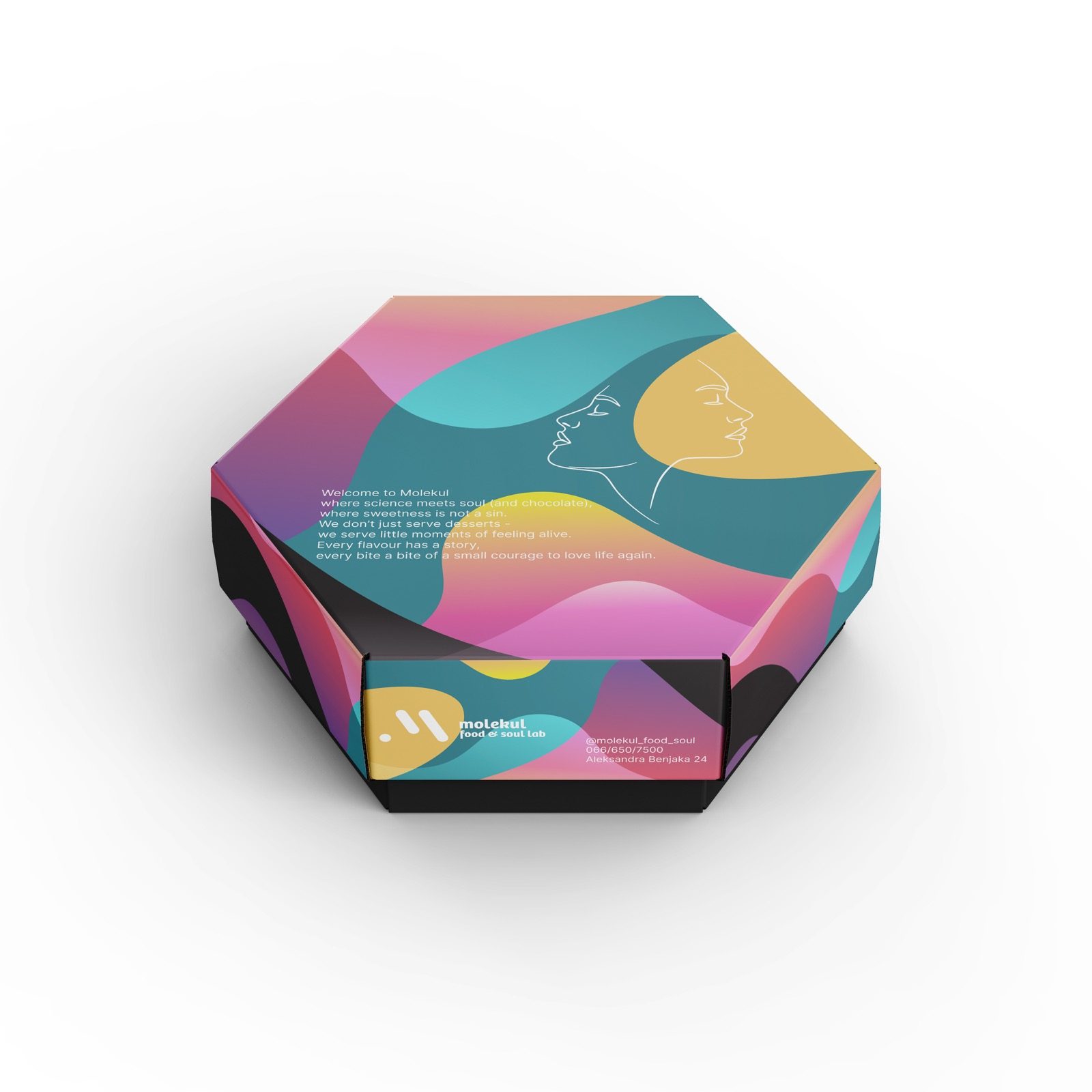
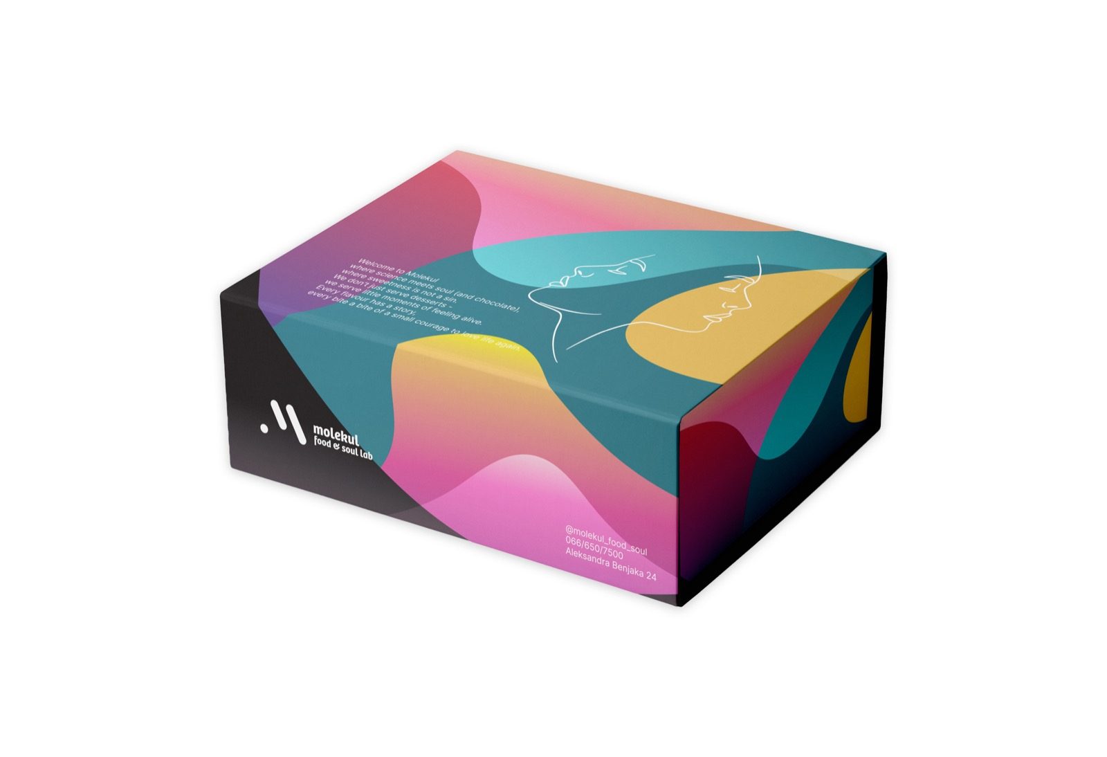
Words on color. Color on feeling.
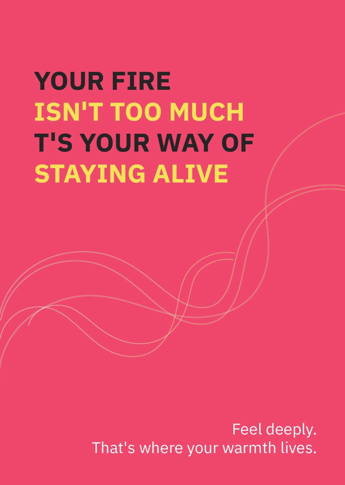
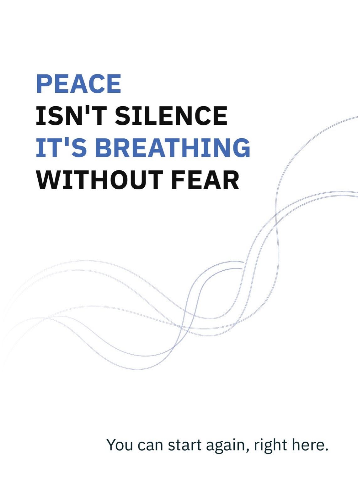
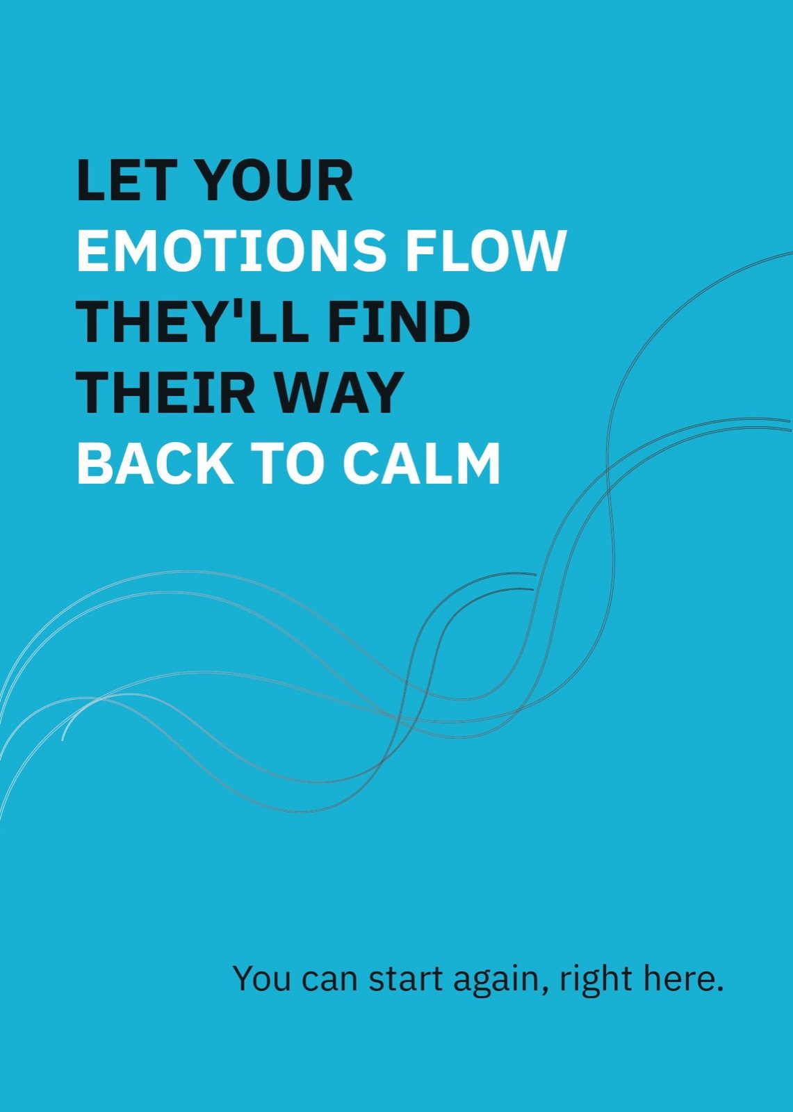
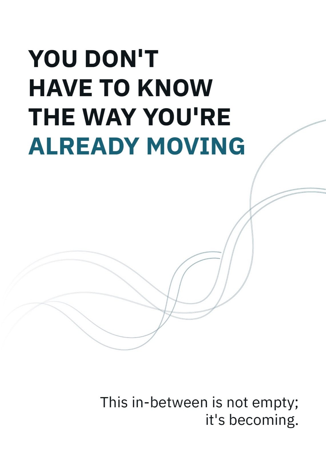
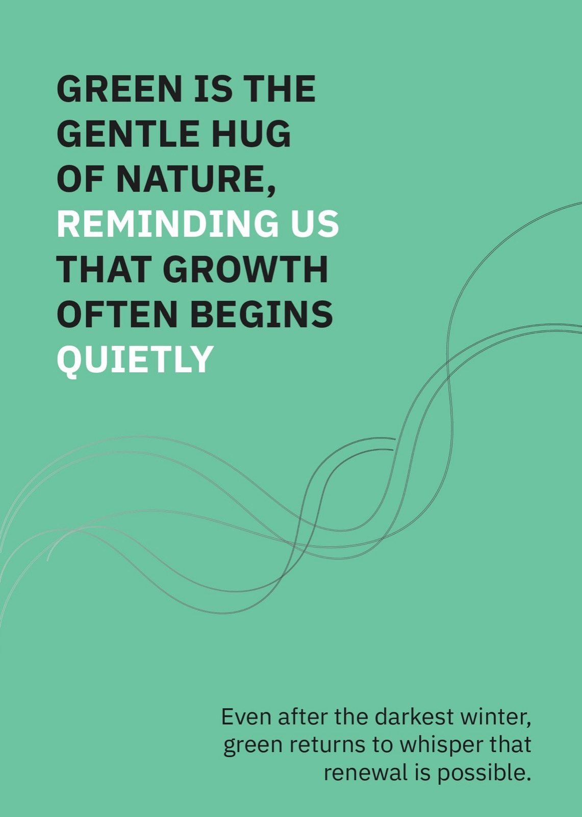
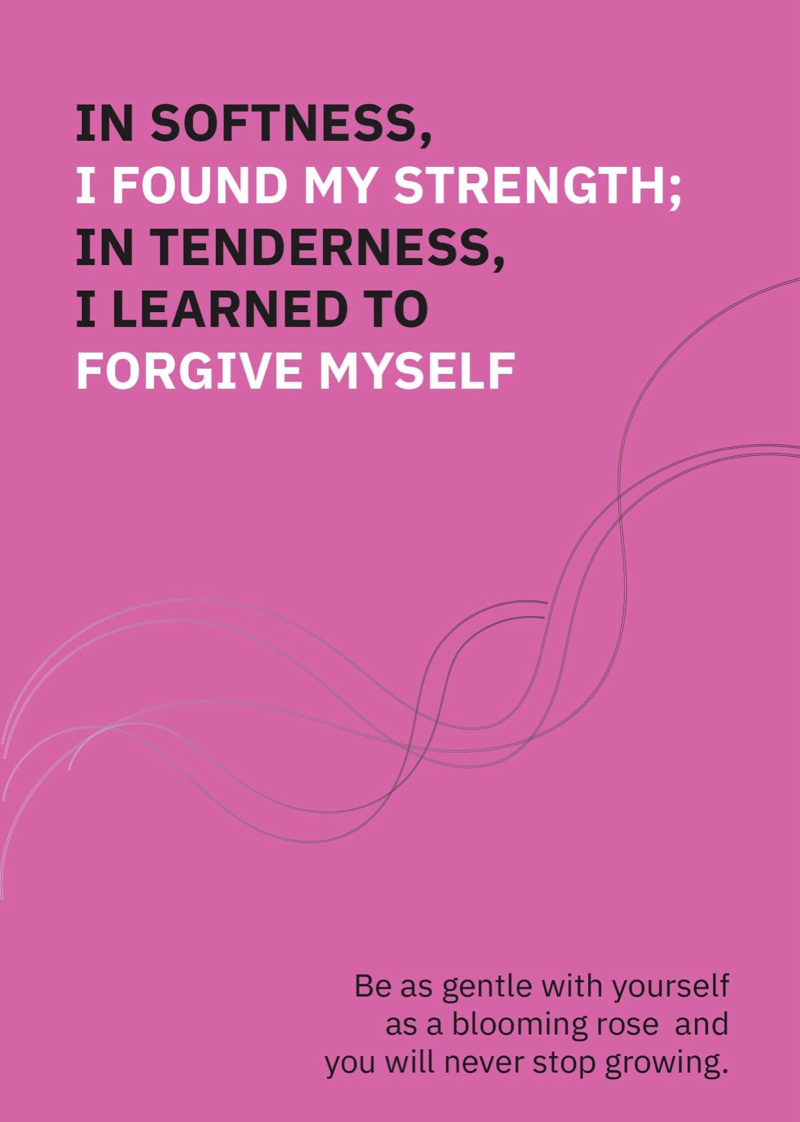
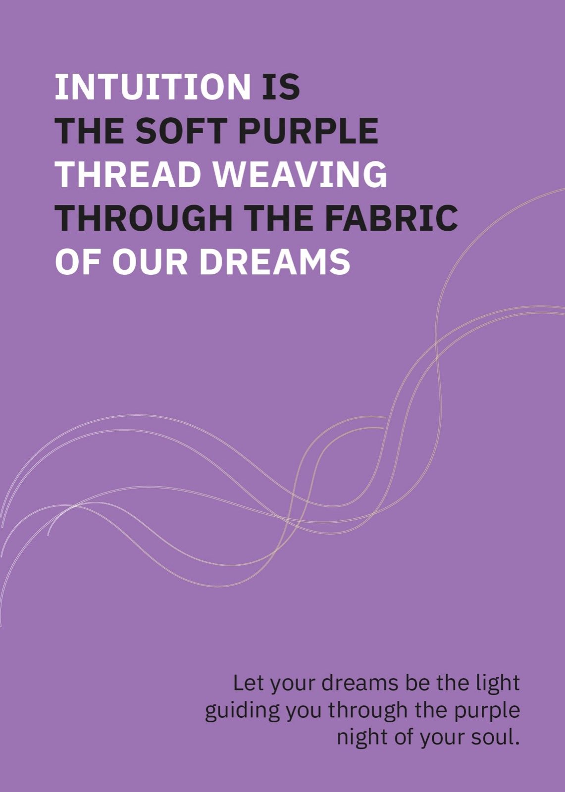
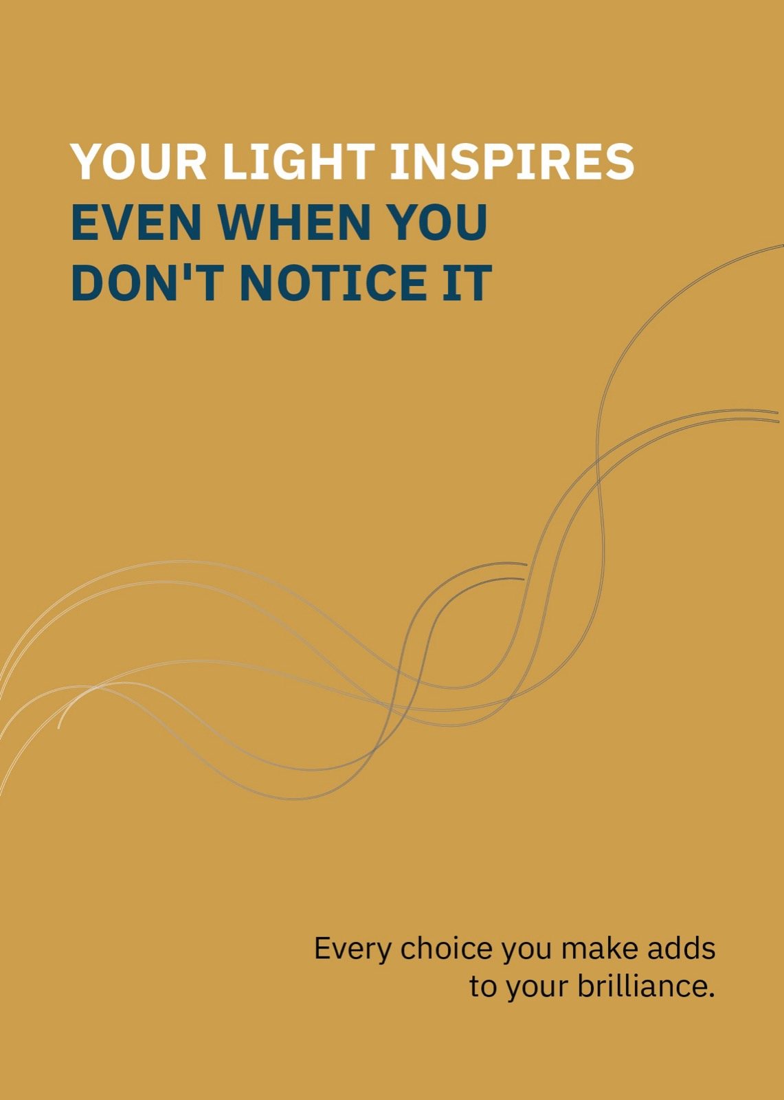
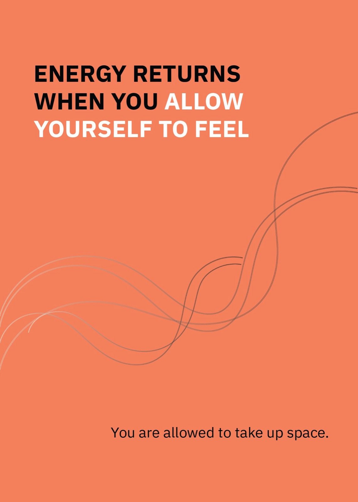
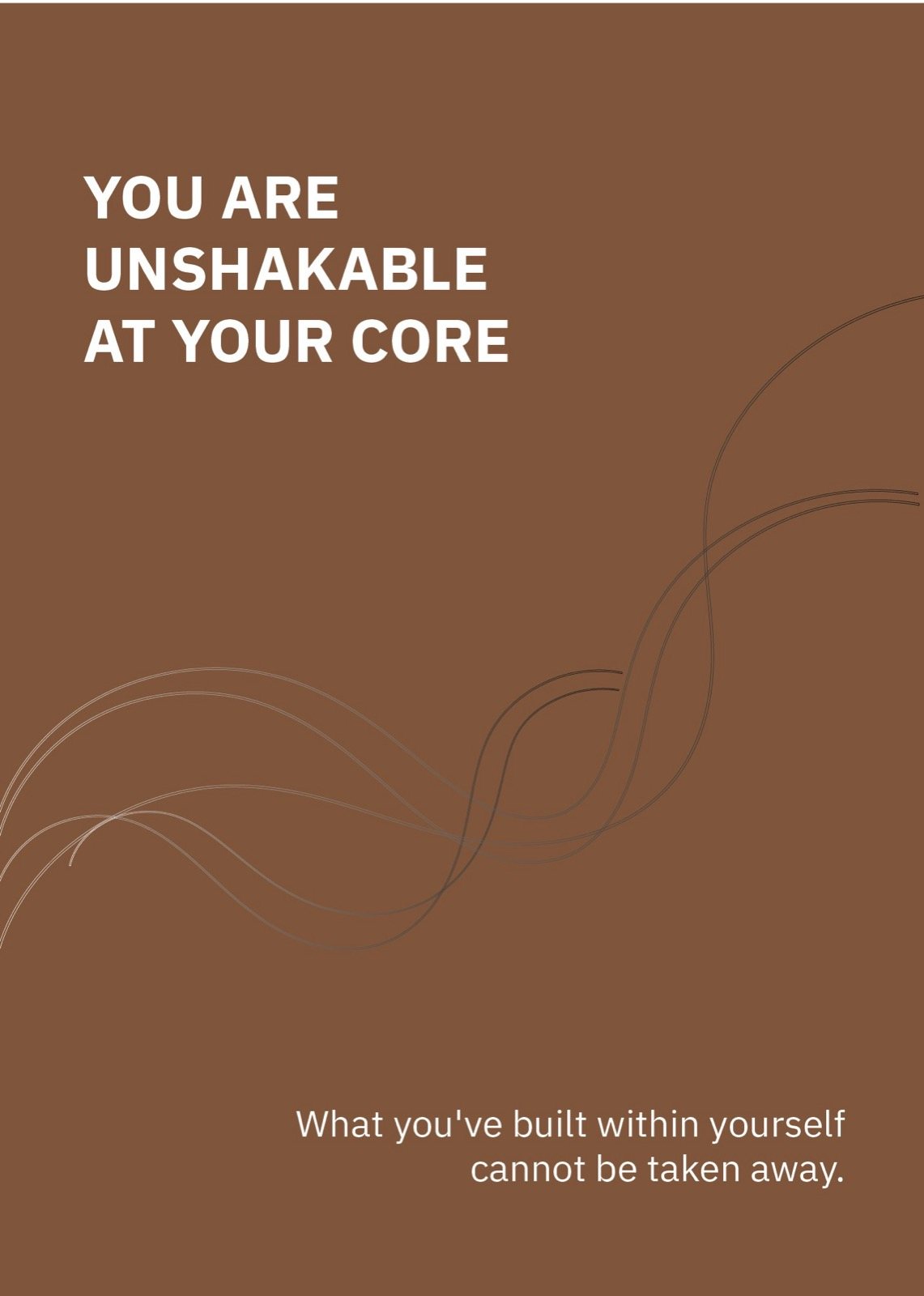
One brand. Many surfaces.
Heavy for the loud moments. Light for the rest.
MOLEKUL · POSTERS · STATEMENTS
Geometric sans, used heavy. Carries the wordmark, the posters, and any time the brand needs to speak first.
Welcome to Molekul where science meets soul (and chocolate). Where sweetness is not a sin. We don't just serve desserts — we serve little moments of feeling alive.
Same family, lighter weight. Used for menu copy, packaging text, body — the soul-side of the brand voice.
Seven colours. One gradient.
Black anchors everything. The rainbow flows beneath — pink, coral, yellow, teal, blue. Together they create the gradient surface that defines every Molekul application.
Ink
#0E1320
The mark, the menu, the structural color.
Pink
#E94B8C
Sweetness, joy, the soul half.
Coral
#E74C5E
Warmth, accents, CTAs.
Yellow
#F4C942
Light, sun, the brightest note.
Teal
#3FB4C5
Calm, water, the cooling note.
Blue
#5570F1
Depth, contrast, structure.
Paper
#FAFAF7
Backgrounds, the page itself.
Four moves worth defending.
A molecular mark, not a swirl.
Every sweet shop logo defaults to a cupcake, a heart, or hand-lettering. Molekul gets a black geometric mark — two pills and a dot. Looks like an atom diagram, reads like a brand.
Black on rainbow, not rainbow on white.
The gradient surfaces are loud, but the mark is the loudest object on them — a heavy black blob anchoring the chaos. The brand never feels chaotic because black always wins.
Posters that aren't advertising.
The Instagram poster series is feelings, not products. "Even in the dark, something inside you still glows." A sweet shop talking like a friend who knows you're tired.
A menu, not a brochure.
Black background, two columns, 30+ products listed straight. Custom Mix bases, crèmes, drizzles, premium toppings, kid's portions, chef's formules. The lab half of the brand showing up where it matters.
We don't just serve desserts. We serve little moments of feeling alive.
— From the Molekul box, 2026