A fashion label where the clothes say everything and the branding says even less. I built a restrained identity around a hand-drawn botanical mark and a single italic wordmark — something to whisper, not shout.
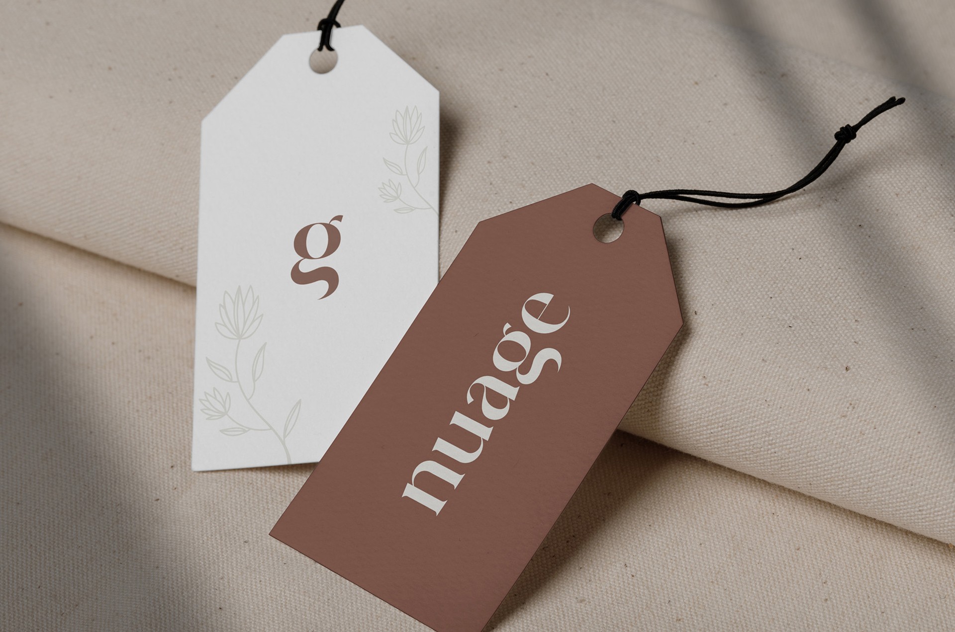
A label without a logo. A brand that fit on a hang tag and a paper bag without breaking character.
The primary mark. Custom display serif, drawn at one weight.
Wordmark
Primary. Used wherever the brand needs to speak by name.

Mark
Secondary. Used wherever space won't hold the full name.
A mark the size of a thumbnail.
The botanical g started as a sketch in a margin. We kept it that way — a hand-drawn signature on every hang tag, every label, every bag.
Small enough to miss on the first pass. Sharp enough to recognise on the second.
One carries voice. One carries information.
A display serif by Mike Lirola, set at one weight.
Used for the wordmark, product names, and headlines — anywhere the brand needs to speak by name.
Composed cotton-linen blend, finished by hand at a small atelier outside Lyon. Cut for warm weather and slow afternoons.
Roman, light weight. Product descriptions, navigation, captions, receipts.
Charcoal
Reserved. Signatures and small print.
Walnut
Primary. Type, marks, considered surfaces.
Stone
Mid-tone. Supporting surfaces.
Sand
Backgrounds. Paper bags, secondary tags.
Cream
The room around everything else.
In use. Same character at every scale.
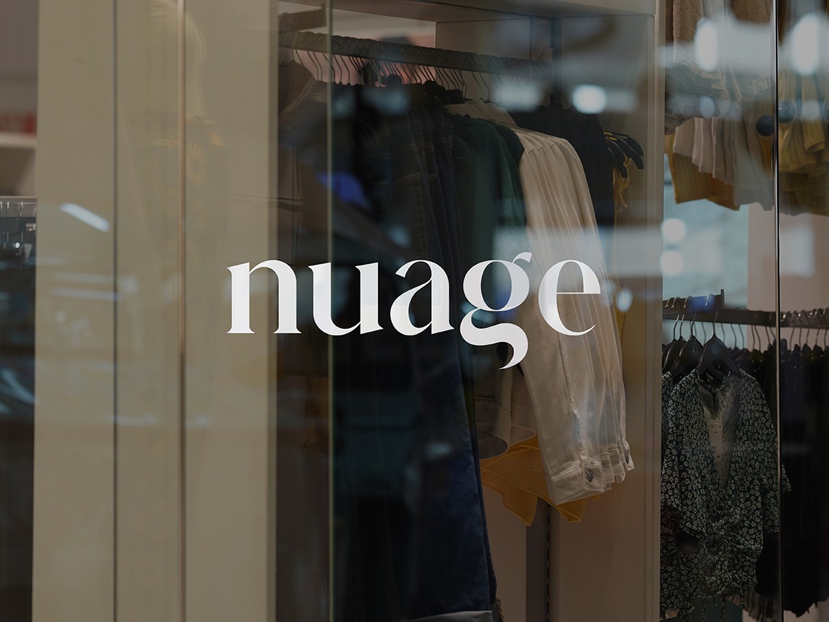 I. Storefront
 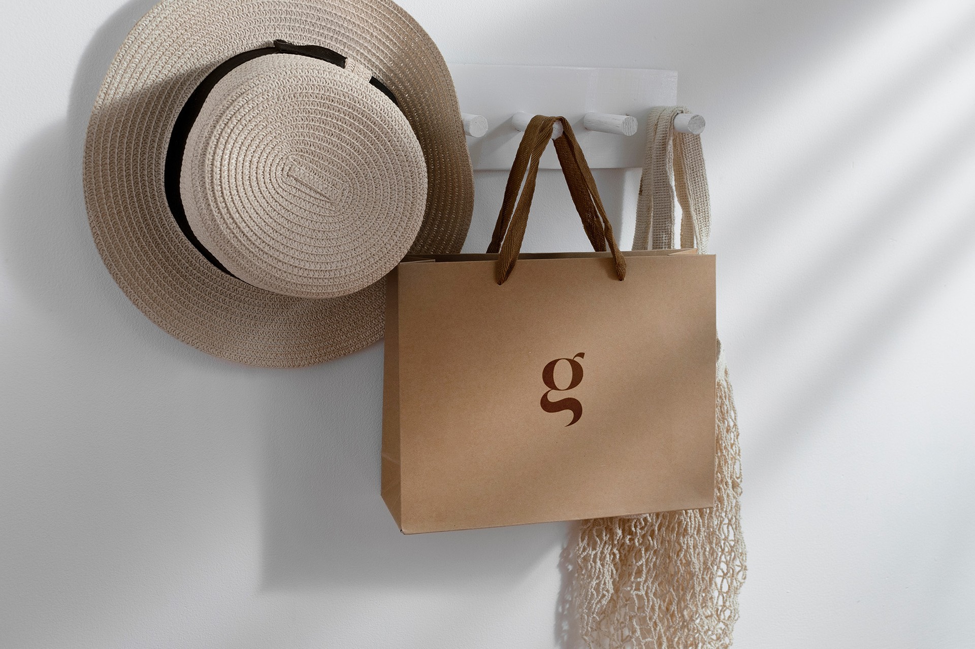 II. Packaging
 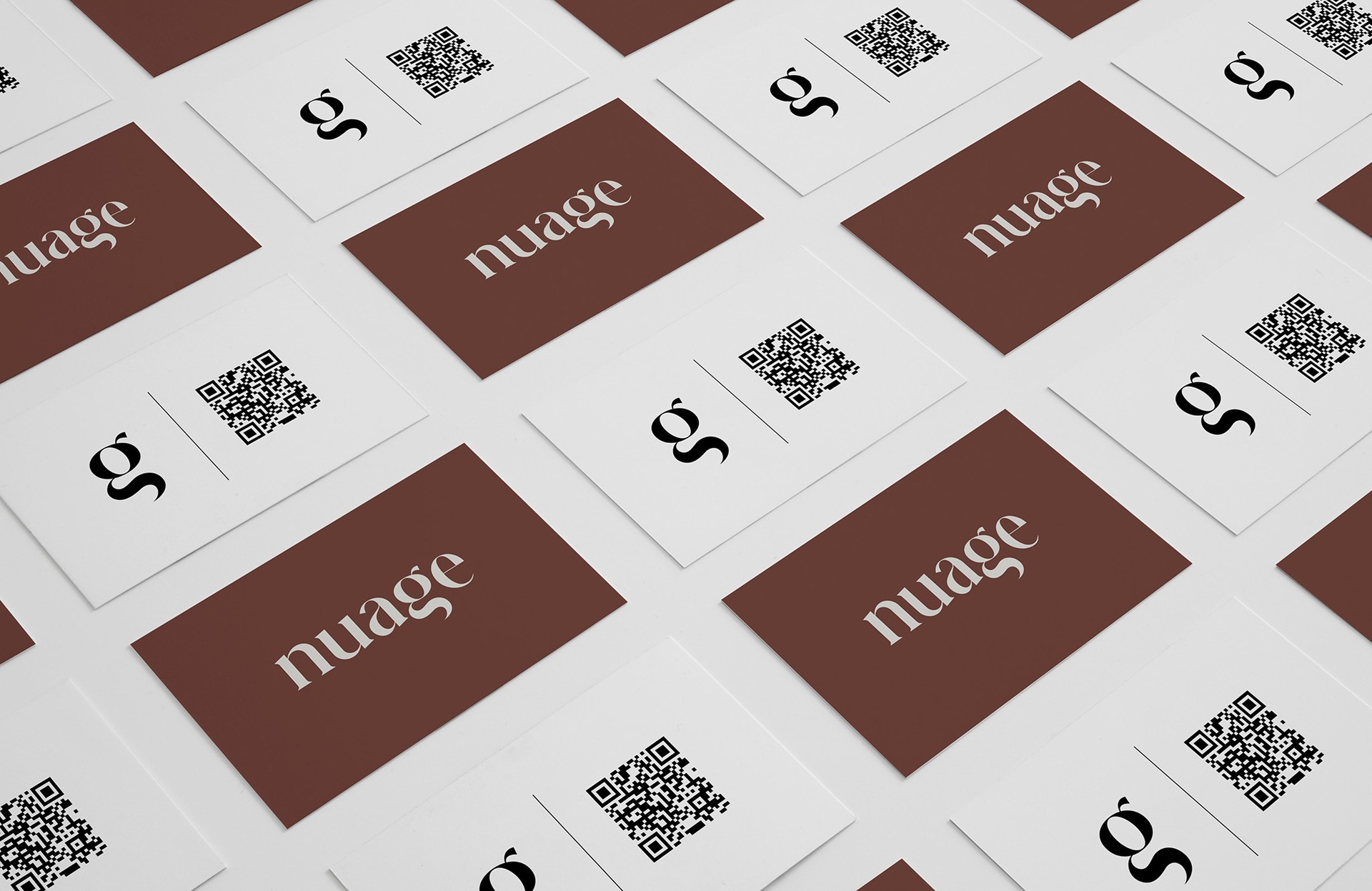 III. Print
 The hardest part wasn't the look. It was holding the line across surfaces — a small bag, a paper card, a window. Each one a chance to overdesign. We kept removing.
— Angela, On The Work