Website Design

The design decides everything. It usually gets decided last.

This is the drawing, not the building. We work out what the site has to make happen, put the pages in the order that makes it happen, and design every screen — desktop and mobile — down to the states nobody enjoys drawing. What you leave with is a Figma file, a design system, and a handoff any competent developer can build from: ours, yours, or the one you already work with.

years designing for the web
6+
weeks from brief to handoff
2–5
narrowest layout we draw
320px
website design UX/UI design wireframes Figma design design system responsive design landing page design website redesign developer handoff
Sound familiar?

It looks fine. It just doesn't lead anywhere.

These are the four things people arrive with. None of them is a coding problem — every one of them was decided while the pages were being drawn, or while nobody was drawing them at all.

  • It's a template with your logo on it

    The same layout as four competitors in the same town, because it came from the same marketplace. Every section exists because the theme had it, not because your customers needed it — so nothing on the page argues for you specifically.

  • Every page ends in a dead end

    A visitor reads to the bottom and there is nothing to do next. No page was designed knowing which page comes after it, so the site is a set of leaflets stapled together rather than a route from a stranger to an enquiry.

  • The mobile version was never designed

    It was squeezed. Three columns became three stacked boxes, the headline broke across four lines, and the button that mattered ended up below a photo nobody scrolls past. Most of your visitors only ever see this version.

  • Nothing matches anything

    Four shades of the same blue, five sizes of heading, buttons that change shape by page. Each screen was designed on its own, so the site reads as improvised — which is exactly how careful a customer assumes you are about everything else.

What you get

Every screen drawn, including the boring ones.

The order is always the same: agree what the site has to achieve, sketch the structure in grey before anyone argues about colour, then design it properly — and hand over a file that can actually be built from.

01

Structure first

Which pages exist, what each one is for, and what a visitor is asked to do on it. Decided before the pixels, because a beautiful site in the wrong order still loses the visitor at the second scroll.

  • Sitemap and page-by-page structure
  • Wireframes in grey, no colour to argue about
  • The route from landing page to enquiry
  • Content plan — what each page has to say
02

The full design, in Figma

Every page, at both sizes, with real text rather than lorem ipsum — because a layout that only works at the length of the placeholder is not a design, it's a picture.

  • Every page designed, desktop and mobile
  • Layouts drawn from 320px upward
  • Hover, empty, loading and error states
  • Two rounds of revisions
03

A system, not a set of screens

Type scale, colour roles, spacing, buttons, forms and cards defined once and reused — so the fifth page costs less than the first and the tenth still looks like it belongs.

  • Type scale and colour roles
  • Reusable components and spacing rules
  • Accessible contrast, checked not assumed
  • Rules for pages that don't exist yet
04

A handoff that survives the build

The file is written for whoever builds it. Most design files lose an argument to the browser quietly; this one answers the questions before they're asked.

  • Clickable prototype of the main flows
  • Named layers, styles and components
  • Notes on behaviour and breakpoints
  • Exported assets and licensed fonts listed
Selected work

Five screens, five different jobs.

None of these started with a template or a homepage. Each one started with a question about what the visitor needs to do next — the design is the answer to that, not the other way round.

Barber Shop Imperial — Website design
01

Barber Shop Imperial

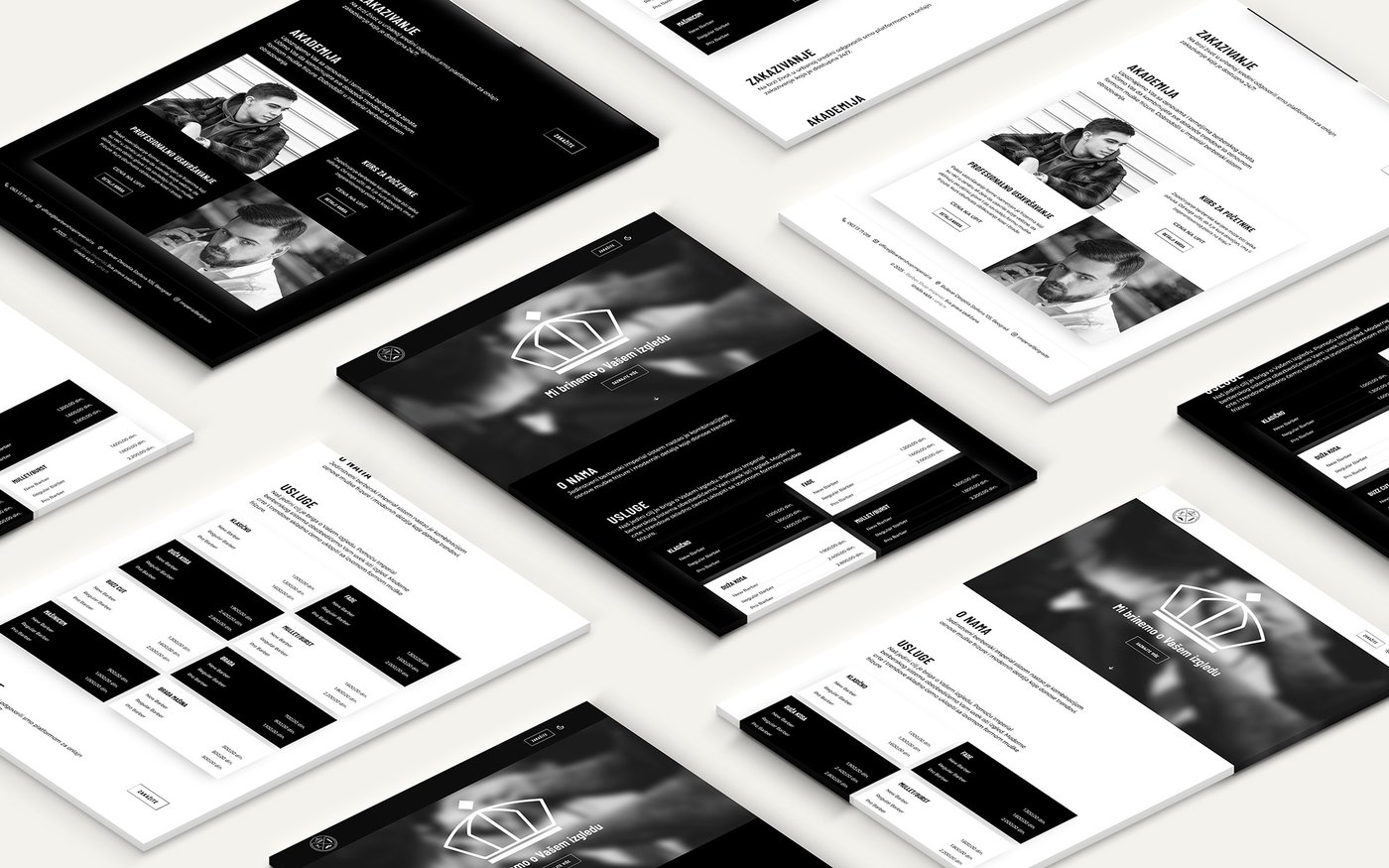
A shop whose interior was already better designed than its website. Dark, warm and confident on screen, with a booking button that never leaves the top of the page.

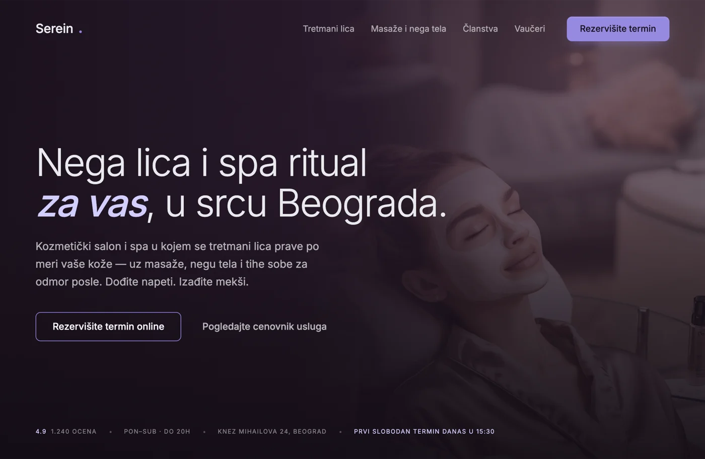
Serein — first screen — Website design
02

Serein — first screen

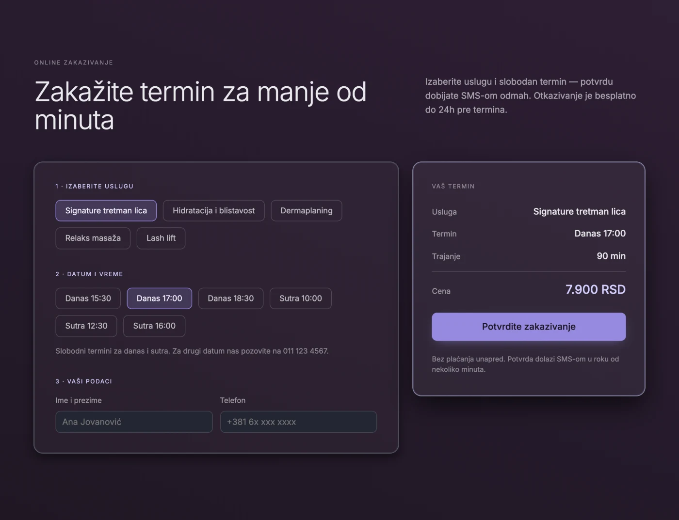
What you do, where you are, and how to book, all above the fold. The bar at the bottom shows today's first free slot, because that's the single fact that decides whether someone books now or later.

Serein — online booking — Website design
03

Serein — online booking

Service, date, time, done. Four screens designed for one flow, including the one where nothing is available — the state that usually gets left to the developer to invent.

Aggelos & Maria — Website design
04

Aggelos & Maria

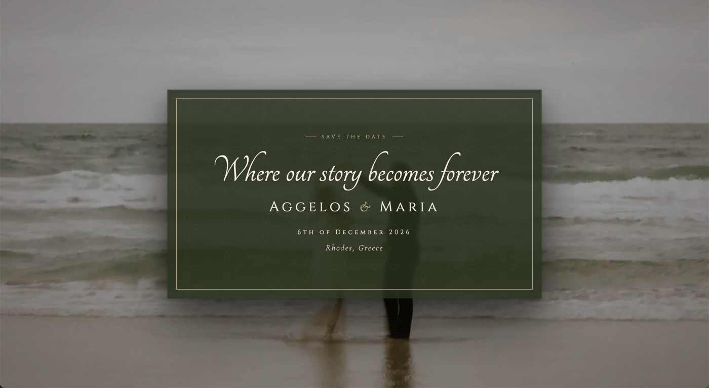
A wedding invitation designed as a single page: six stages of the day, two venues and an RSVP, drawn to feel like printed stationery on every screen the guests opened it on.

Dashboard — Website design
05

Dashboard

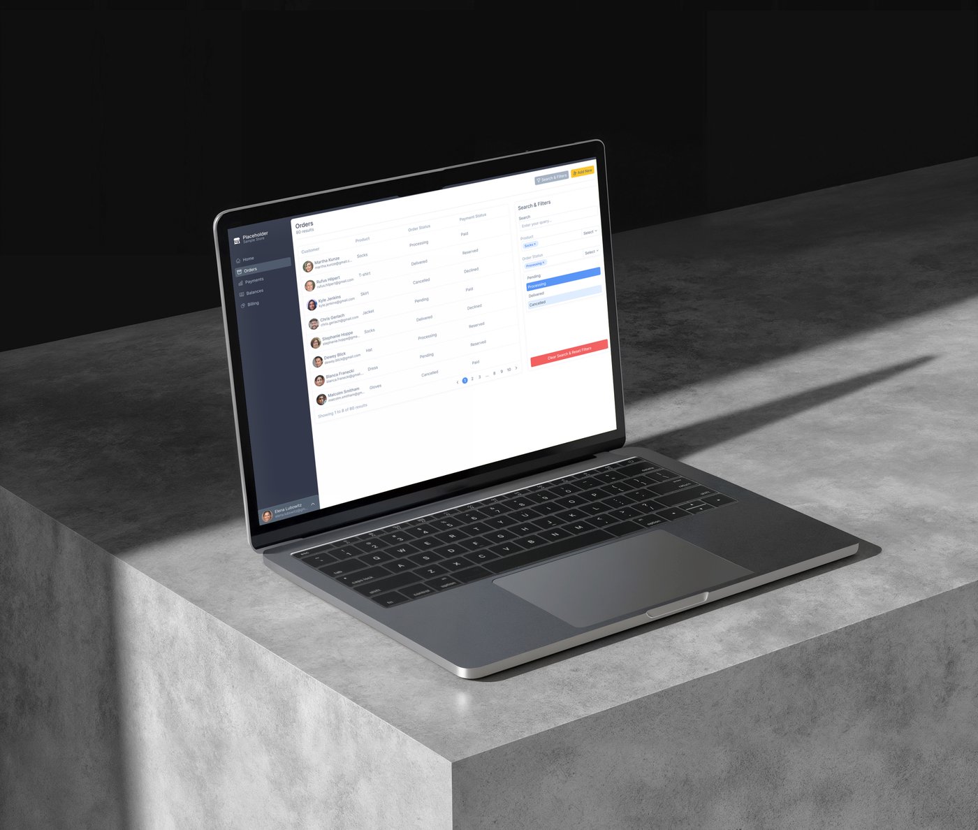
An admin interface for an e-commerce platform. Every component drawn rather than imported, and the empty, loading and error states designed instead of left to chance.

How we work

From first conversation to handoff.

  1. 01
    30 minutes

    Free consultation

    We talk about the business, the customers, and what the site actually has to do — enquiries, bookings, sales, or simply being credible. No sales script. You leave knowing what you need, even in the cases where that turns out not to be us.

  2. 02
    1 week

    Structure and wireframes

    Sitemap first, then grey wireframes of every page. This is the cheapest week to change your mind in, and the one that decides most of the result — moving a section here takes a minute, moving it after the design is drawn takes a day.

  3. 03
    1–3 weeks

    Design

    Every page in Figma, desktop and mobile, with real text. You see it in the browser as a clickable prototype rather than as a flat image, because a design is a thing you move through. Two rounds of revisions are here.

  4. 04
    A few days

    Handoff

    The file organised, components named, behaviour and breakpoints written down, assets exported. We walk your developer through it — or, if the build is ours too, this is the day it starts.

Investment

Clear prices, nothing hidden.

Landing Page

One page that has to do a specific job — a launch, a campaign, a single service.

from €600
Timeline · 1–2 weeks
  • Structure and wireframe
  • Full design, desktop and mobile
  • Hover, form and success states
  • Type and colour system
  • Developer-ready handoff file
  • Two rounds of revisions
Most popular

Website Design

The usual choice — a whole site designed, structure included, ready for anyone to build.

from €1,200
Timeline · 3–5 weeks
  • Everything in Landing Page
  • Up to twelve pages designed
  • Sitemap and wireframes for every page
  • Design system with reusable components
  • Clickable prototype of the main flows
  • Blog, portfolio or booking screens
  • Handoff walkthrough with your developer

Design & Identity

When the brand needs building too, so the site isn't designed around a logo nobody is happy with.

from €2,200
Timeline · 6–9 weeks
  • Everything in Website Design
  • Full brand identity and logo suite
  • Colour and typography system
  • Brand guidelines PDF
  • Business card and stationery
  • Launch assets for social and email

Prices are starting points and depend on how many pages there are and how much of the flow has to be designed. You get an exact quote after the free consultation. This is design only — building the site is quoted separately and starts at €900, and commercial font licences are billed at cost with your approval first.

Common questions

What people ask before they commit.

01

Does this include building the website?

No — this is the design on its own, and it's priced that way. You get the structure, every screen and a handoff file, and you can take it to any developer you like. If you'd rather we build it, that's our development service: from €900 to code a design that already exists, so design and build together usually land between €1,500 and €3,000 depending on size.

02

What exactly do I receive at the end?

A Figma file you own, containing every page at desktop and mobile size, the states around them, and a design system of type, colour and components. Plus a clickable prototype of the main flows, exported assets, a list of the fonts used and where they're licensed from, and written notes on how things are meant to behave. Nothing is locked to us.

03

Can my own developer build from it?

That's what the handoff is for. Layers and components are named, spacing follows a system rather than intuition, and the notes cover breakpoints, hover states and what happens when a field is empty. We'll get on a call with them at handover and answer questions during the build at no charge — a design nobody can build is not a finished design.

04

How much does website design cost?

From €600 for a single landing page and from €1,200 for a full site of up to twelve pages. The number moves with the number of pages and how much of the flow has to be drawn — a booking journey with its edge cases is more work than a page of text. You get a fixed quote after the free consultation, before anything starts.

05

How long does it take?

One to two weeks for a landing page, three to five for a full site. Timelines stretch in one place almost every time: how quickly feedback comes back. Give us the text and photos early — or ask us to help write them — and the whole thing moves faster.

06

Do you design in Figma or somewhere else?

Figma. It's what developers expect, it costs you nothing to view, and it means you can leave comments directly on the screen you're talking about instead of describing it in an email. You get edit access to your own file, permanently.

07

I already have a brand. Can you design around it?

Yes, and it's the common case. Send the logo, fonts and any guidelines and we design inside them. If parts of the identity don't survive the move to a screen — a logo that disappears at small sizes, a colour that fails contrast on text — we'll say so and suggest the smallest fix rather than quietly redesigning your brand.

08

Do you work with businesses outside Serbia?

Yes. Most projects run entirely online, with clients across Serbia and Europe. If you happen to be in Novi Sad, we're glad to meet in person.

The design is the part you can't fix later

Everything a website gets judged on is settled while it is being drawn. Which page a stranger lands on, what they are asked first, what they have to scroll past to find the price, whether the phone version is a layout or a squeeze — all of it is decided in a design file, and all of it is cheap to change there. The build is just the faithful execution of those decisions. Change them afterwards and you are not editing a design, you are paying twice.

That is why the most expensive part of a template is not the licence. A template decides your structure before it knows your business — which sections exist, what order they come in, what a visitor is asked to do first. So a shop that lives on bookings ends up with the booking link in the footer, and a studio that wins work on its portfolio opens with a paragraph about its founding year. The pages are filled in afterwards, around a shape drawn for somebody else entirely. Everything after that is decoration on a decision that was already made wrong.

Designing on purpose is mostly about giving that decision back to you. We start in grey wireframes precisely because there is nothing to like or dislike about them yet — no colour to distract from the fact that the case-studies section is sitting three screens below where anyone will look. Once the order is right, the visual work is quick and the arguments are small. Once the order is wrong, no amount of typography rescues it.

We design websites for small businesses and studios in Novi Sad and across Europe: hospitality, beauty, trades, architecture, and a few products. You leave owning the file, the system and the fonts list, free to build it with us or with anyone else — which is the point of buying a design rather than renting a website.
Next step

Half an hour, no obligation.

Tell us about the business and what the site isn't doing. You'll leave with a concrete recommendation and a price — no pressure and no sales script.

Book a free consultation