A logo for an architecture studio. Drawn the way they design — every angle considered, nothing left to chance.
UNQ is a design-forward architecture studio. Their work is defined by clean geometry, honest materials, and lived-in spaces that feel both modern and unmistakably intentional. They needed a mark that spoke with the same confidence as the buildings they design.
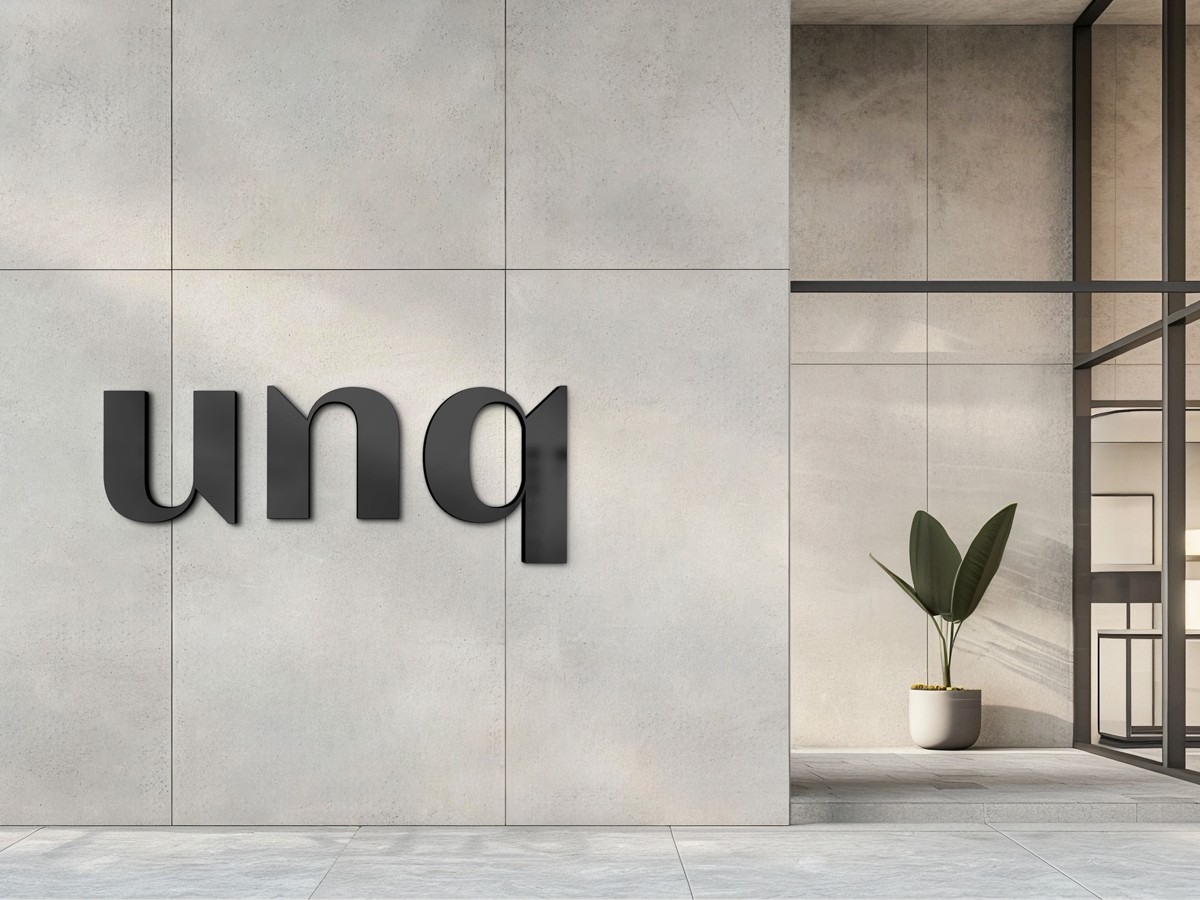
a single mark that says everything.
clarity. character. simplicity.
instantly readable.
No second glance, no decoding. The mark reads at 32 pixels and at four meters with the same legibility.
distinctive without being decorative.
Every angle considered, every negative space earned. Nothing for effect. The shape is the personality.
strip away everything unnecessary.
Custom-drawn from scratch. Reduced to the smallest set of strokes the name could survive.

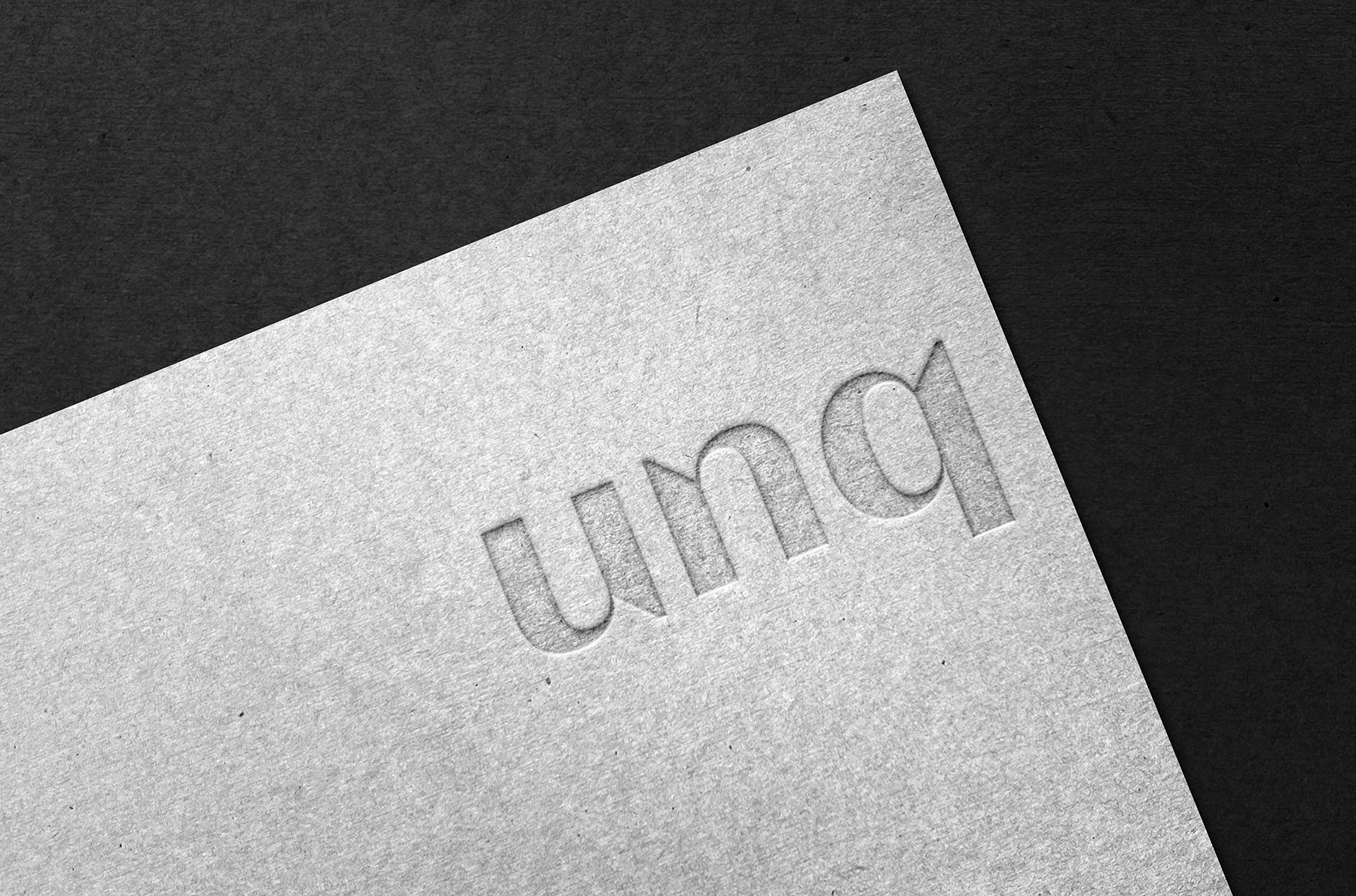
drawn like a floor plan.
Architecture studios live and die by the details — and their logo should too. The starting point was the lettering itself. Rather than choosing an existing typeface and tweaking it, the wordmark was custom-drawn from scratch, treating each letter like a floor plan: every angle, every proportion, every negative space considered.
The lowercase treatment was a deliberate choice. It softens the mark without weakening it, giving it an approachable confidence — the visual equivalent of an architect who lets their work speak louder than their ego. The result is a wordmark that feels both engineered and human.
The “q” became the defining character. Its tail extends into the space below the baseline, creating a subtle asymmetry that keeps the mark from feeling rigid. It's the kind of detail you notice on a second look — and that's exactly the point. Good architecture rewards closer inspection, and this logo does the same.

five values. no colour.
Restrained and material-driven — concrete, steel, and paper. The palette lets the architecture, not the branding, be the loudest thing in the room.
obsidian
#1A1A1Aconcrete
#3D3D3Dsteel
#6B6B6Bash
#B0B0B0paper
#F0EFEDa good logo represents you before you walk in the room.
— Notes on UNQ, 2025