01
Logo suite
Not one logo. The full set you actually need, once your name starts appearing in places you didn't plan for.
- Primary logo and lockup
- Secondary and stacked versions
- Icon and favicon mark
- Black, white and one-colour cuts
Most businesses buy a logo and find out six months later that they still can't make an Instagram post look like themselves. We build the part nobody sells you — colour, type, layout and the rules that hold them together — so everything you make from then on already looks like you.
These are the four things people arrive with. Each one costs you the same thing, quietly, every month — being forgotten by someone who already met you.
One file, usually a PNG with a white box behind it. The moment you need a business card, a shopfront or a story template there's no rule to follow, so every new piece gets invented from scratch and none of them match.
Three people making graphics, three sets of fonts and three slightly different blues. Recognition is built entirely on repetition — and nothing here repeats.
Vector, CMYK, Pantone, bleed. A logo exported once at 800 pixels for a website cannot go on a sign, and discovering that at the print shop costs you weeks you had already promised to someone else.
The work is good. The presentation says side project. Clients decide what you're worth from what they can see, long before they ever speak to you.
Everything below arrives as working files with written rules for using them — so the system still holds two years from now, whoever happens to be making the artwork.
Not one logo. The full set you actually need, once your name starts appearing in places you didn't plan for.
The two things that make you recognisable from across a room, before anyone reads a single word.
The document that stops the system falling apart the first time somebody else opens the files.
The system put to work on the pieces you need first, so it arrives proven rather than theoretical.
Every one of these started as a conversation about the business, not about the logo. What the mark looks like is the last decision we make, not the first.
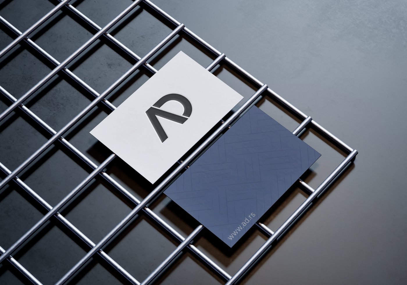
A welding workshop that needed to read as precise rather than as cheap and industrial. The mark comes out of a weld seam; the card stock does the rest of the talking.
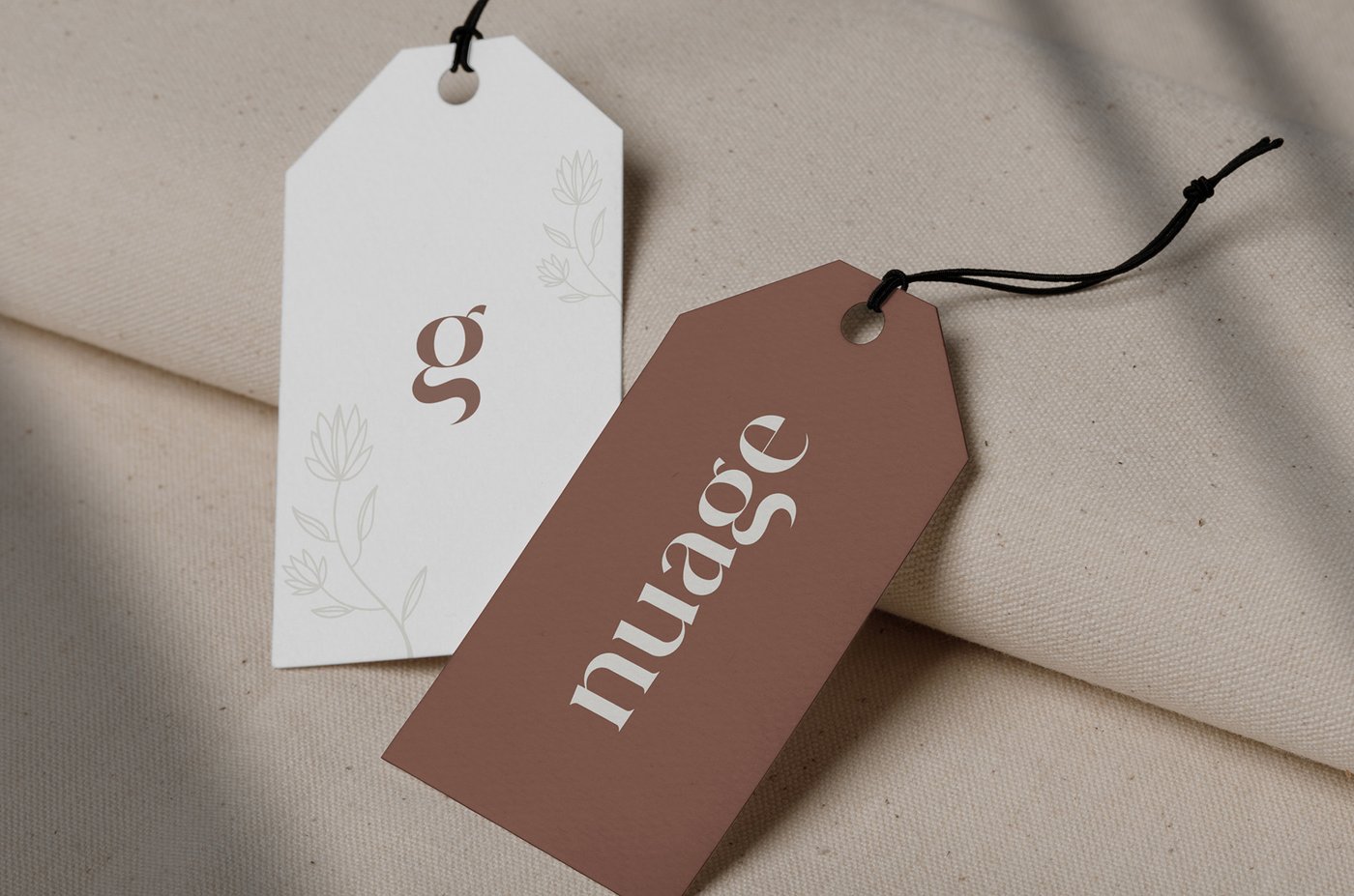
Minimalist skincare, where restraint is the product itself. Almost nothing on the card — which is always the hardest version to get right.
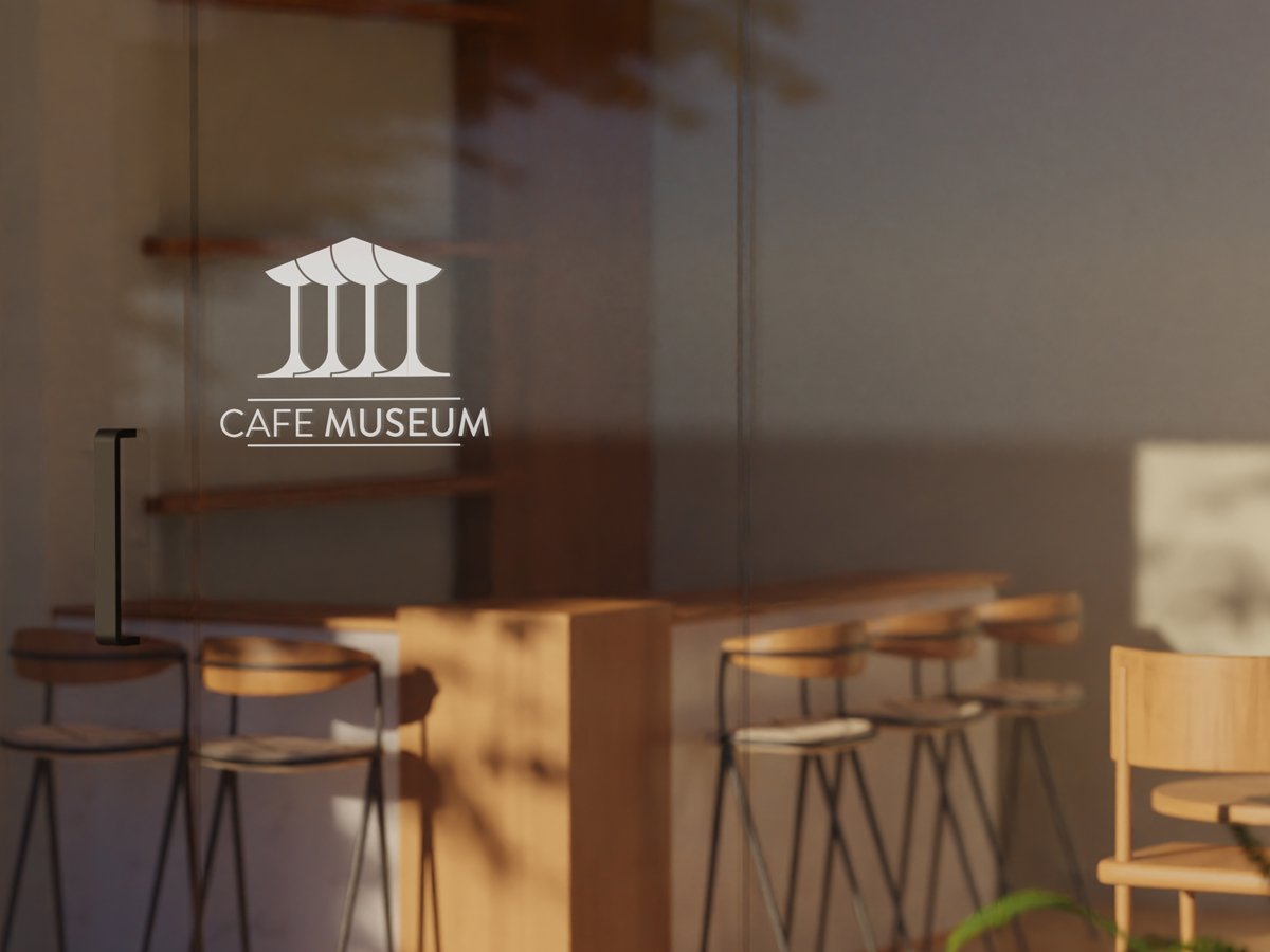
A café inside a cultural space, so the identity had to sit beside the art on the walls without ever competing with it.
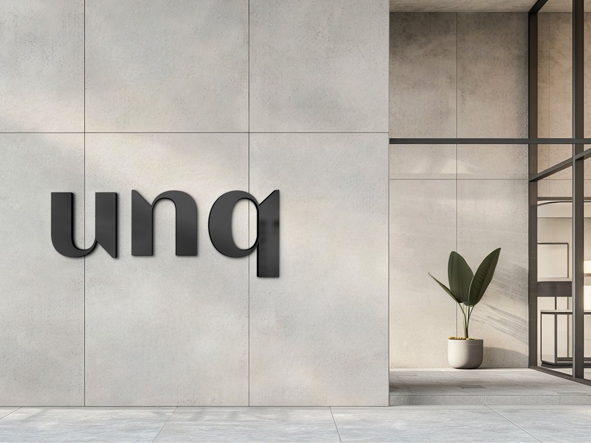
An architecture practice. One mark, drawn to survive being engraved, embossed, and set two millimetres tall on a drawing sheet.
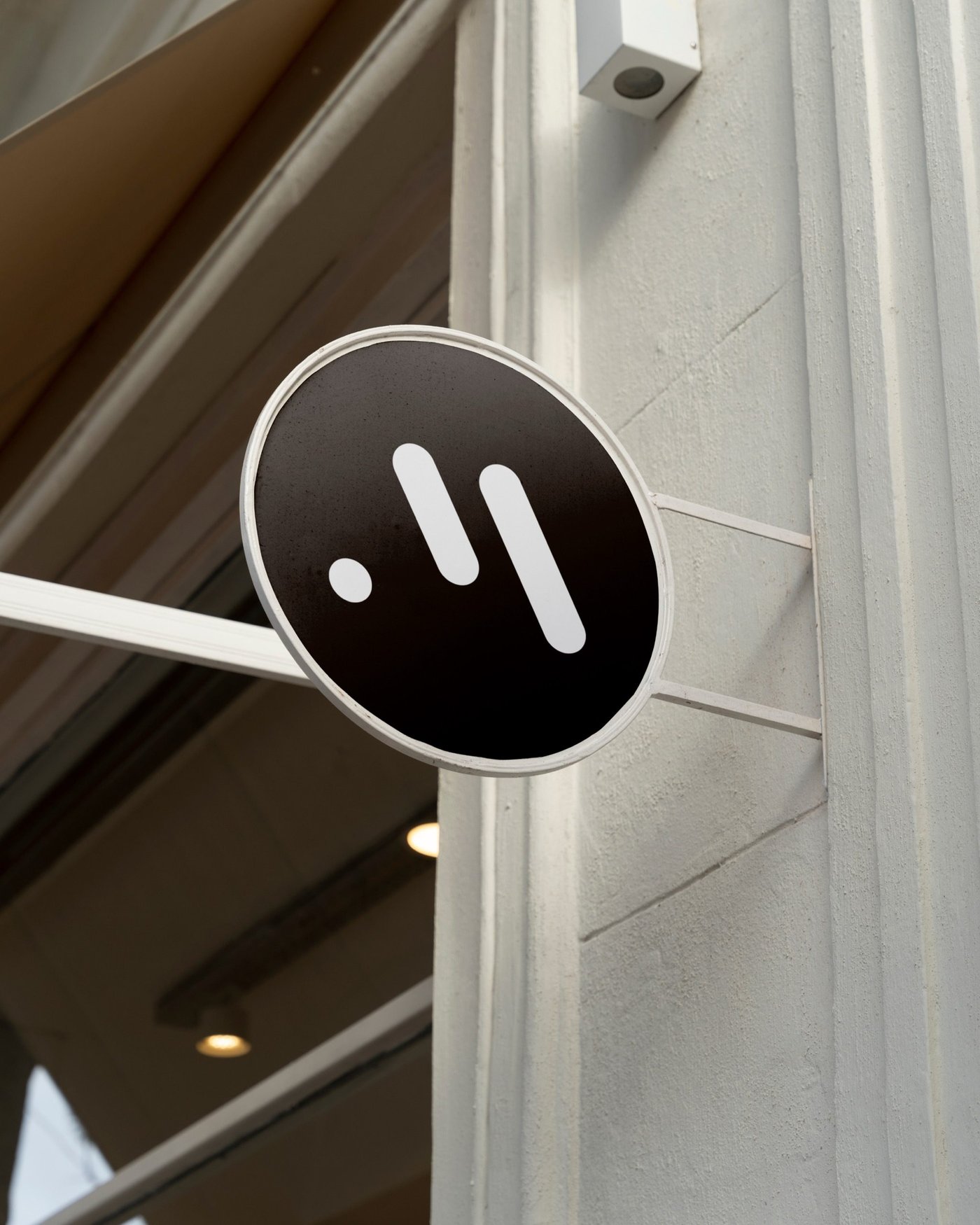
Science on the plate. The signage was designed before the logo was finished — knowing exactly where a mark lands changes what it ought to be.
We talk about the business, the customers, and what the brand actually has to do. No sales script. You leave with a clear picture of what you need — even in the cases where that turns out not to be us.
Positioning, tone, and two or three visual directions on the table. We agree on one before anything gets refined, so we're never spending three weeks polishing the wrong idea.
The chosen direction becomes a full system. Two rounds of revisions are built into the price — enough to get it right, few enough to keep the work decisive.
Every file exported in every format you'll need, the guidelines written, and a walkthrough so you can actually use all of it without calling us.
For a new business that needs a mark and the basics done properly.
The usual choice — everything needed to look like one company everywhere at once.
When the identity has to land on packaging, signage, or a whole print run.
Prices are starting points and depend on how many applications you need. You get an exact quote after the free consultation. Typefaces with commercial licences are billed at cost, and never without your approval first.
A logo is one mark. A brand identity is the system it lives inside: colour, typography, layout, imagery, and the rules holding them together. A logo on its own can't make a business card, a shopfront and an Instagram post look like they came from the same company. The system is the part that does that.
Two to three weeks for a logo suite, four to six for a full identity. The timeline depends mostly on how quickly we get feedback at each stage — the design work itself is predictable, the waiting is what stretches.
Two or three directions, each one a genuine proposal we would be happy to build out. We don't present ten options. That's a way of handing the designer's job back to the client, and it reliably produces weaker work than committing to a small number of considered ideas.
Then we keep it and build the system around it — plenty of projects start exactly there. We'll tell you honestly if the mark won't survive being used small or in one colour, but we won't redraw something just for the sake of having redrawn it.
All of them. Vector source files, plus exports in every format for print and screen, including one-colour and reversed versions. They're yours outright — no ongoing fee, no licence to renew, and no need to come back to us to use your own brand.
Yes. Most projects run entirely online, with clients across Serbia and Europe. If you happen to be in Novi Sad, we're glad to meet in person.
A logo is cheap to commission and expensive to own. The cost arrives later, in pieces: the business card that needed a second typeface nobody chose, the sign painter asking for a vector file that doesn't exist, the intern picking a blue by eye because there was never a value written down. Every one of those is a small decision made by whoever happened to be there, and a brand is nothing more than the sum of those decisions. Buy only the mark and you have bought the one part of the identity that takes the least discipline to maintain.
What a brand identity does is take those decisions out of the day. Colour stops being a preference and becomes a specification. Typography stops being whatever was already installed on the laptop. The logo gets a minimum size, a clear space, and a defined set of situations it is allowed to appear in. None of that is decoration — it is the infrastructure that lets a business of three people put out work that looks like a business of thirty, consistently, without a designer in the room every single time.
The other reason to build the whole system is that it is the only way to find out whether the mark actually works. A logo looks fine in the middle of a white slide; that proves nothing at all. It has to hold up embossed on card, reversed out of a photograph, two millimetres tall in a footer, and cropped to a circle by a platform that never asked your permission. We design the applications alongside the mark for exactly that reason — so the weaknesses surface during the project, while they are still cheap to fix, instead of eighteen months later on a shopfront you have already paid for.
We work with small businesses and studios in Novi Sad and across Europe: hospitality, architecture, skincare, food, trades. Every identity is built from the business outward rather than from a trend inward, and every one is handed over with the source files and the rules, so that it stays yours.
Tell us about the business and what isn't working. You'll leave with a concrete recommendation and a price — no pressure and no sales script.
Book a free consultation